Oslo - Skyscrapers, streets, tunnels, fjords and sun.

My last weekend I spent in Oslo. When I saw the cheap Wizzair connection, I instantly decided to go for a spontaneous trip searching for new challenges and inspiration abroad in a beautiful country. To be honest, Oslo is not the typical Norwegian city, so the challenge became real very quickly. No red or white wooden houses. Instead, my shuttle bus dropped me after a two hours ride from the airport in the middle of nowhere in the center of Oslo, among skyscrapers and office buildings. I was very surprised of that. So I started my walk over a bridge to enter the Barcode Business District, where you can find several buildings in different shapes and design rowed up next to each other. Nothing spectacular, to be honest. Anyway, the trip was about taking different pictures than usually and also to create my first picture set, to create a consistent general impression and style within the whole post. So I tried to find interesting angles to depict the typical office buildings in an artistic way, taking advantage of their diagonals, simplicity and reflections, in the post production I reduced the range of colors in most pictures to a minimum and increased the contrast dramatically. It's quite obscure, but I like the vibe of it.

Afterwards I strolled along the river amongst several building cranes, quite boring. Every window reflection showed building cranes, that's why I did not post any of the Opera pictures here, what everybody would expect, since it became one of the most iconic buildings in Europe due to its splendid architecture. Anyway, I moved on and walked through the city's main street. I had such beautiful memories of Oslo, because I've been to Oslo already when I was a teenager. But my point of view was completely different, this time. It is really a normal average western European city with lots of shops, glamour and consumption. So I decided to focus on the unusual again, the cute old-fashioned magazine shops. Unfortunately the sky was overcast and just a muddy grey showed up. So I decided to search for the next target on my checklist, the tunnel in the Nationaltheatret metro station. I had lots of fun there playing with the lines and tilting my camera to unusual angles. But also people crossed the tunnel and insisted on deleting all pictures which they crossed (although you could not see their faces...weird...anyhow!) Of course I did not delete all of them, still there are some cool ones left to be revealed at a later time on flickr. 

The next day's schedule was quite simple and easy manageable: I just wanted to visit the  Vigeland Park and the Huk peninsula. I imagine the park to be very beautiful in every other season than winter. Anyway I want to its less popular spots capturing the picture of the small waterfall (I just love moving water!). But on my way down to the waterfall, I slipped away on the ice, slided down the hill and crashed into bushes. Well, not a very shining moment for me, but that's the adventure. That's what I love photography, not only the results, but the story behind them. Furthermore it shows my full determination for the project Oslo, where I did not allow any room to laziness or giving-up. I just hurt myself on the knee, I am still alive and In the end I had a nice picture, so it was worth it, don't you think?
After spending an hour in the park, I headed towards the Huk peninsula, in the Oslo fjord, where I observed the weather and the sun for three hours, walking around the peninsula two times to find the perfect spot for the sunset. It was really a tough challenge to stay so long and to keep up the motivation, but I did not give up. In the end, the persistence and endurance totally payed off and rewarded me with those beautiful shots from the beach, when the sun finally won the battle against the clouds. Also those weather phenomenons I documented very well, but I still need to work on those. Hence the will be released on flickr soon. So just enjoy the best shots which I published so far:

All in all this trip clearly outlined, how determination, persistence and endurance combined with good location scouting can reveal the full potential in me to take pictures and open my eye, heart and soul every time again to see the beauty in the ordinary. It was a very motivating and educational trip! 

In two weeks I'm flying again to Norway, this time to Alesund. I am totally looking forward to it! It's supposed to be a magical vibrant cozy city surrounded by water and high mountains! So stay tuned for more Norwegian beauty. I know for sure that every adventure I will go on, brings me one step closer to my dream, the dream of sharing my love to photography with the world and to make a living of it. It's all about patience, persistence and endurance!

An advanced introduction into the Basics of professional photographs - Preparation, Knowledge and Composition.

Since I started living abroad in Poland, I started improving the quality of my pictures. At the same time, my new audience and some of my friends began to show a strong interest in the production of professional photographs. On the shady side, some people and clients showed a huge lack of respect and appreciation for my work, due to their conviction that photographs are taken very easily and without any concept or effort (going out for 10 minutes, taking the perfect shot within a blink of an eye, go inside, use magically Photoshop and everything is done). 

But the complete opposite is the case: Photoshop is important, but just 20% of the published picture. The other 80% encompass skills that you have to improve for your whole photographer life.

Certainly, I know that this post is not a full description for taking great pictures, but nevertheless I'm convinced that you can treat it as a good guideline to think about your creative process by planning and composing your pictures. 

The most unimportant element of the whole process is your camera and their components, more important are your tripod (+ remote) and mostly youreye, your skills and your knowledge.  For all those pictures featured in this post,  I just used my kit-lense (18-55mm) and a cheap 50mm lense (~90-100€) for my portraits, due to my constant lack of money. Usually people tend to reduce all skills of a photographer to his equipment. So if they want to become a "photographer" they spend thousands of Euros or Dollars for expensive camera equipment, although they have no idea how to use it correctly. That's why I don't answer the following frequently asked question anymore: "Which camera do you use?", because it doesn't matter at all. So don't be jealous about others' equipment and try to reach the limits of your camera equipment, before you think about upgrading. Moreover, you should consider the topics below. 
The most important prerequisites besides technical knowledge and basic equipment (DSLR) for successful shootings are:

  1. Research
  2. Planning + Time management
  3. Patience
  4. Tripod
  5. Composition

The first step, called research, deals with defining your idea, organizing models and requisites for portraits or other kinds of shots involving other people; furthermore with defining your location for taking landscape photographs. Hereby, I mainly want to focus on conceptualizing landscape photographs. So try to find interesting locations and exciting subjects for a photograph by usinggoogle maps, goole streetview and browsing photography communities (e.g. flickr, deviantart, 500px). In my personal opinion, I prefer flickr, because it offers different styles and very different creative artists, in comparison to 500px, where the most famous pictures are nearly taken in the same way. Deviantart is a community for all branches of art, so the diversity of topics could complicate your research for high quality photographs. 

The second phase, the planning, includes the timing of your shooting, e.g. weather forecasts, inclination of the sun, sunset time / sunrise time / twilight / blue hour / golden hour. You should consider to emphasize your pictures' mood and uniqueness by taking pictures with special (mystical) light created by the sun. In the next step, called time management, you should plan your arrival. Thereby I prefer to reach the location 45 minutes before e.g. the sunset starts. So you can warm-up, think about your composition and get inspired by your location. In addition, you have some slack time, if you can't reach the location due to unexpected problems (e.g. traffic jams, accidents). Sometimes it happened that my train was stuck in a station with the consequence of missing the sunset.

The third phase is very important, because you need patience to wait for the perfect moment, to endure and to try out camera angles. Usually the length of my stay on my chosen location comes to two hours, always searching for the best place and trying out different styles. Maybe it could be a useful example to explain you my usual schedule for a shooting: 1-2 hours travel time for one way, 2-3 hours stay at the location, 1-2 hours travel time back. In summary, good photographs need good planning and a lot of time. Please, do not underestimate this factor; it's a lot of time, but it totally pays off!

In the fourth phase, you should use a tripod. Do not leave your flat without grabbing a firm tripod; you'll need it, to reach the full range of sharpness; you need the tripod as well for adjusting your camera during the next phase called composition. But before, I want to emphasize that you should consider to buy a very firm tripod (2,5 kg or more) with the possibility to add some weights that it can't be moved or blown by the wind. Security of you and your camera has always the highest priority. You will need the tripod to take long exposure pictures to give your pictures the uniqueness you are seeking for,e.g. by softening water or creating light trails of chasing cars.

One of this post's most considered element is supposed to be  the composition. Therefore, I'm going to explain referring to my images some ways to visually arrange and compose your shots. As I mentioned before, the prerequisite to adjust your pictures is the tripod. In addition, you should turn on your live-view monitor, turn on the grid (to divide in your pictures horizontally and vertically in thirds) and turn off the image stabilization, because you don't need it (you already use a firm tripod). As the last thing, turn on the remote mode to take the shot without clicking the trigger so that you reduce the vibrations to avoid blurry or fuzzy pictures. 

So let's start to talk about the composition. Over the past years, photographers and psychologists found out that the human eye prefers pictures in a horizontal orientation. Moreover, they could find some geometric rules/ guidelines to compose your photograph, e.g. the golden ratio and the rule of thirds
Usually you can't see the golden ratio (Link) on your live-view's display without a modification of your camera software (e.g. magic lantern). In contrast, the rule of thirds (Link) is visible on your live-view, by turning on the grid function (as mentioned above). So I recommend to use the rule of thirds, since its handling is easier and more comfortable in comparison to the golden ratio. For the beginning this sounds very simple and mathematical or just like placing a stencil on your display adjusting your picture to it and click. But the following examples will show you that you still have millions if even not billions of variations to adjust your picture to the grid, depending on your angle and standpoint. In general for landscape photographs, I recommend to climb as high as possible or to extend your tripod as high as possible so that you can see very far by capturing the foreground as well as the background at the same time.

You can see this high position of the camera on the first picture, which allowed me to capture the pillars, as well as the moving waves and the main subject (the abandoned ruin in the sea). The composition, as mentioned above, is exactly adjusted to the intersection points of the rule of thirdshorizontal andvertical lines: The horizon and the upper ledges of the front pillar.
The whole concept consists of symmetry and powerful lines heading from theforeground opening main subjects (two frozen pillars) to the background main subject (ruin) connected by a powerful line of similar miniaturizing objects (pillars). This main lines' power gets emphasized by lines created by the tidal waves' movement (yellow) heading to the symmetry axis. To create this effect, just attach your camera to tripod and set up a long shutter time which emphasizes the role of the tripod in comparison to light sensible lenses or big expensive cameras. Using long exposure, all fixed objects are staying sharp and all moving objects are blurring or softening.

In summary, symmetry can be one element to create powerful lines using foreground elements opening the picture to the background element so that no area of the picture is useless!

This picture is as strictly geometrically adjusted as the first picture, but this time without the element of symmetry. Nevertheless, it follows the same concept as the first picture, due to its composition with lines dragging your eye through the picture from the foreground's- (cellar entrance) to the background's main subject (cross on the mountain).The upper horizontal line is adjusted to the horizon (as usual), the vertical lines are adjusted to the cellar entrance in the foreground and the cross in the background. So you find the main subjects on the intersection points again.

But first of all, your eyes start by catching sight of the lightest element in the foreground. From there it opens the picture into two directions.
The first direction is shaped by the picture's next light areas, so it follows the light heading to the darkest area in the background (right yellow arrows). The second direction of the light is created by the shiny foreground element of the cellar entrance, because of its lighting by the first light. From there, it follows objects with a similar character (like the pillars in the first picture) heading in the same direction as the first yellow arrows. But the lighted entrance also creates another anchor point and opening element, because your eye looks upwards till the end of this area's light following the small hills' contours to the cross (red). In the end there are also supporting lines, created by the fence, the snowy path and the smoke stacks as similar patterns (white) and some small lines created by the edge of the roofs (violet). All those lines merge together in the same point and follow along the horizon in the last step to the cross on the hill.

In summary, you can see a bunch of lines heading from the foreground's main subject to the background's main subject. All of this was just possible by using a long exposure time with the camera fixed on the tripod, allowing to emphasize the strong light contrasts.

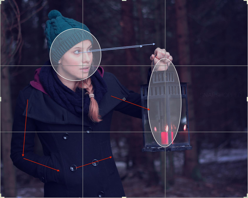
But those lines are important for portraits as well, as you can see in the third picture. The center of the girl's body, as the main subject, is adjusted to the vertical line, as well as the candle / lantern as the second main subject of the picture.

Her eyes in her light face are the anchor of the whole picture, since your eyes are caught firstly by the lightest element in the picture. From there, here eyes drag you to the right side of the picture looking upwards and searching for something. This viewing direction opens the picture to the right side; at the same time her point of view and her expression emphasize her haunted feeling .

Thematizing her body language, her right and left arms (red) are introducing the lantern, as the second key element, the candle inside the lantern, which should emphasize the whole haunted and afraid mood straying through the dark forest.  

Bildschirmfoto 2014-01-28 um 15.14.38.png

In the last chapter of this post, I want to analyze a more complex picture. As you possibly might recognize, this picture is not adjusted to the rule of thirds, moreover to the difficult golden ratio. This picture has also been taken on a tripod using long exposure, what is visible again on the softened water. Rethematizing the composition itself, the center pillar of the bridge is adjusted to the vertical line. This subject is introduced from the light foreground to the background following the line created by leaves and stones in the direction of the bridge (yellow). When your eyes finally arrived at the bridge, the bridge itself introduces the waterfall as the anchor and main subject at the same time, due to its high level of brightness and as the primary source for several lines spreading out of it.  

The first group of lines is heading towards the left corner, opening the picture to the left side. But you can't know that you would find a second smaller waterfall on the left side out of the picture. This fact is very important, because this second waterfall has to be considered as the producer of a small line opening the picture back inside the picture to the right, since it produced floating water from the left to the right.

The second group of lines is heading downwards the waterfall in the right direction, opening the whole picture to the right sidecreating smaller lines(which I omitted in favor of more clarity). Thereby both "groups" of lines merge in one point and move together to the right side. To force your eyes to follow the water, I chose a high contrast between the red autumn leaves, the dark stones and the mystical deep blue tone of the water that easily catches the spectators' eye.
_______________________________________________________

Article's summary:

  • You don't need lots of money
  • You don't need lots of expensive equipment: Lenses, camera bodies, filters
  • 80% Preparation & Know How, 20% Photoshop
  • Concept --> Shoot --> Photoshop, instead of Shoot --> Photoshop
  • Prerequisites: Research, planning, time management, patience, tripod & composition 
  • Composition:
    • Golden ratio & rule of thirds
    • Connection of foreground- and background elements using powerful lines
    • Contrast (Light, color, shapes)
  • Optimism & endurance
  • Inspiration (Gallery-browsing, music,...)
Top