interior

Light painting hotel interiors with a constant light.

As a photographer, it is very important to set yourself apart from other competitors, especially these days, when ordinary people purchase a camera and consider themselves a photographer. Obviously, that is far away from the truth: Spending lots of money on camera gear makes you as much a photographer, as purchasing good expensive kitchen utilities makes you a good cook. ;) But how should ordinary people know the difference? That’s why I find it very important to make my work process as transparent as possible, to exactly show my clients - who aren’t professional photographers - how I work and what to expect from me. it is easy to impress people with a crazily big amount of expensive gear. Instead, I impress my clients in a different way: e.g. “When I heard, you’re arriving by train to the shoot, I really wondered how you would fit in all your gear into your luggage.” but once they see me work, they quickly find it out that it is way more important to bring the gear you really need. They also see that I use many tools, but they are small and handy instead of big and heavy: “Wow, you really know every trick in the book! We had many photographers here, but I have never seen anyone working the way you work. Impressive!”

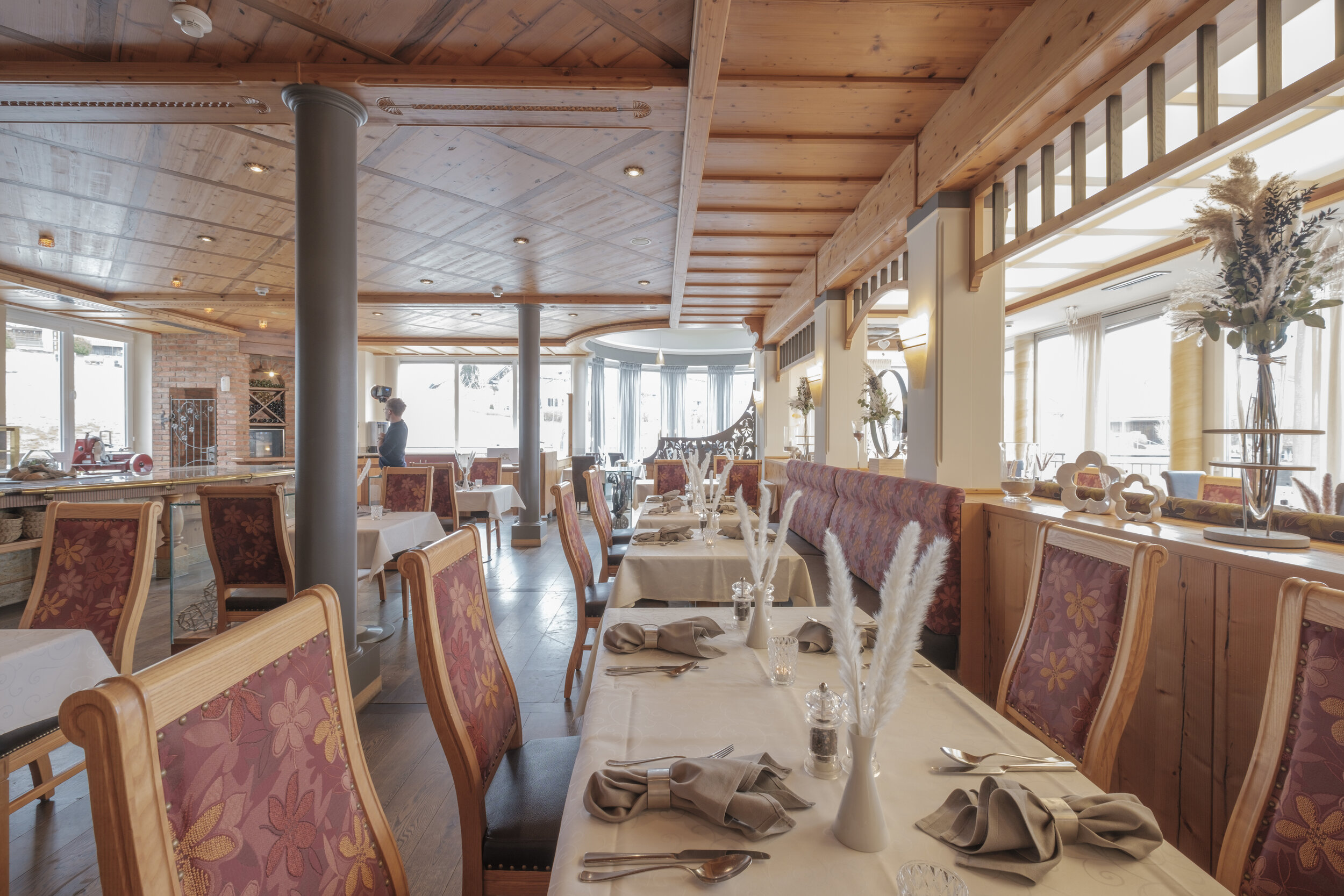
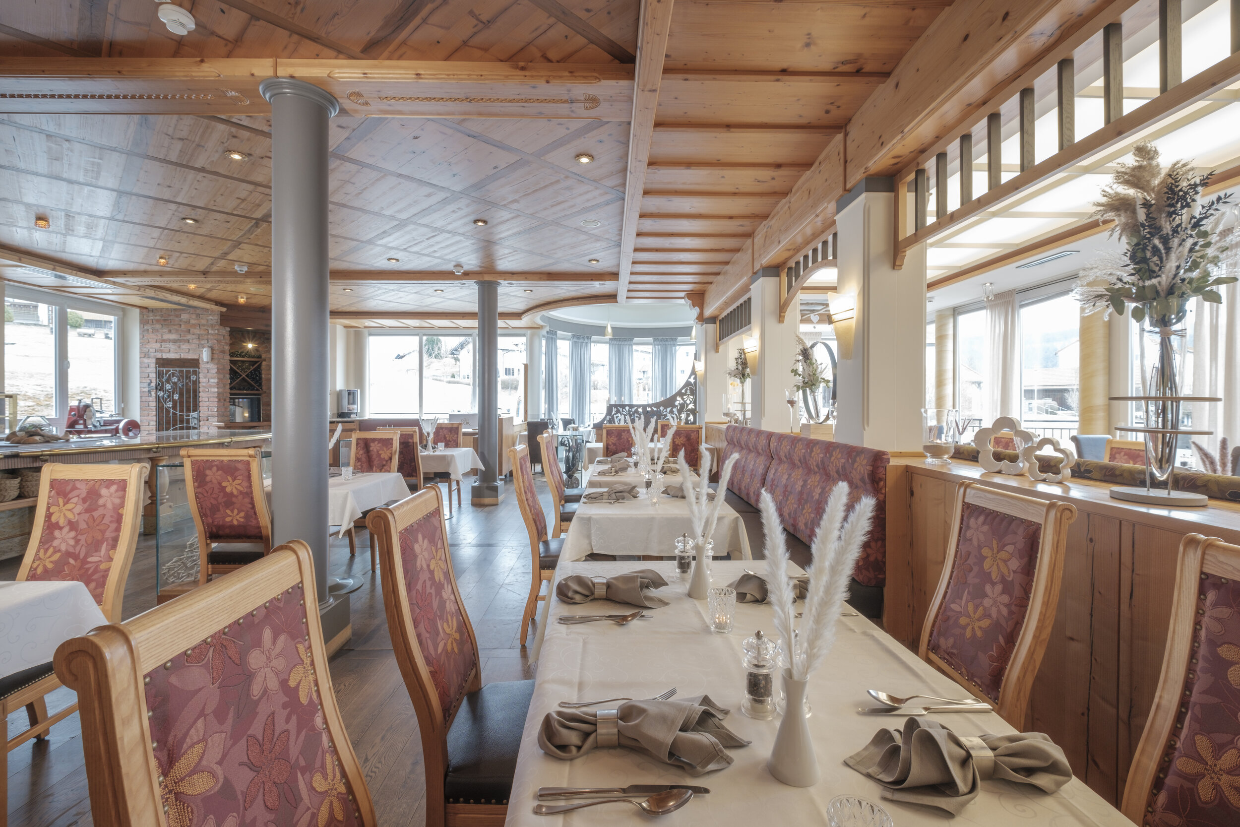
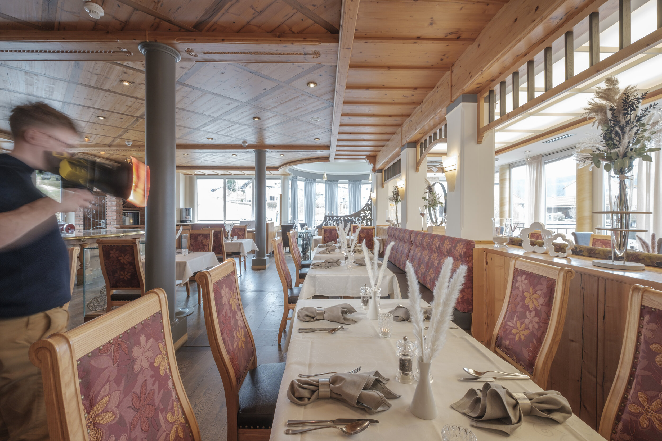
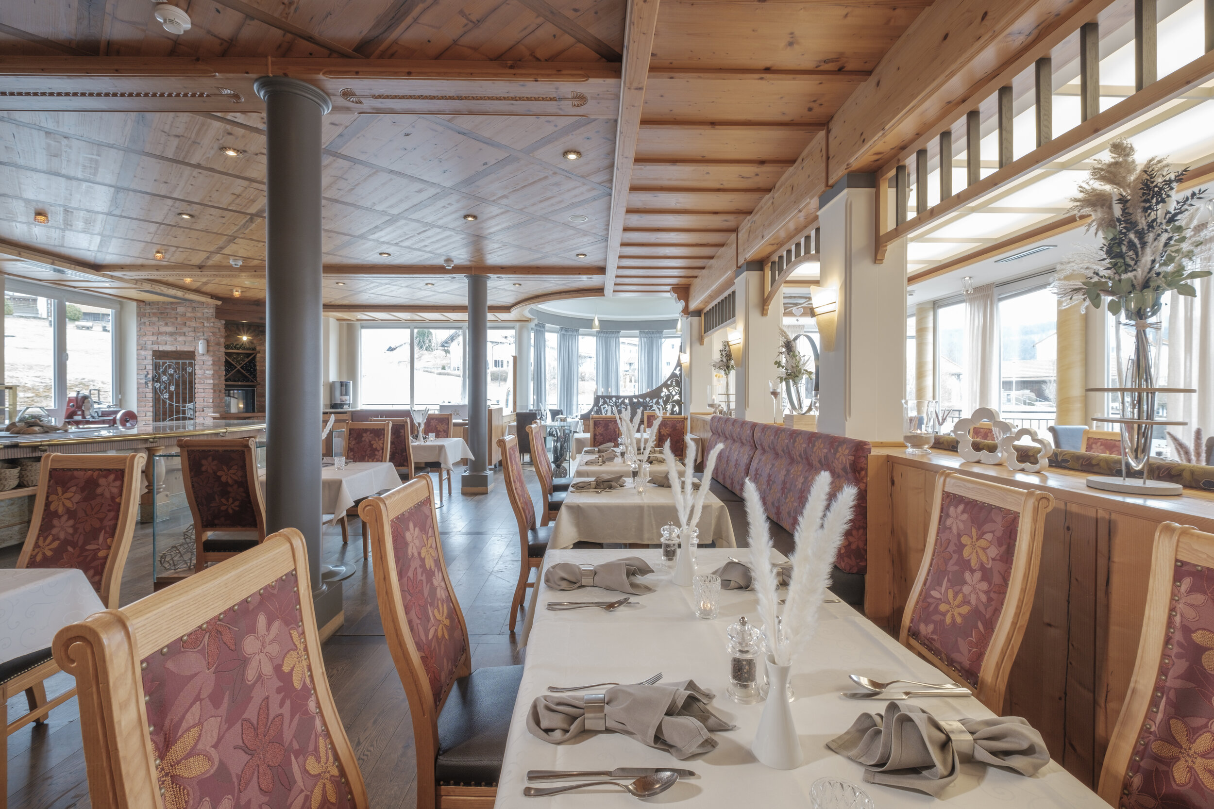
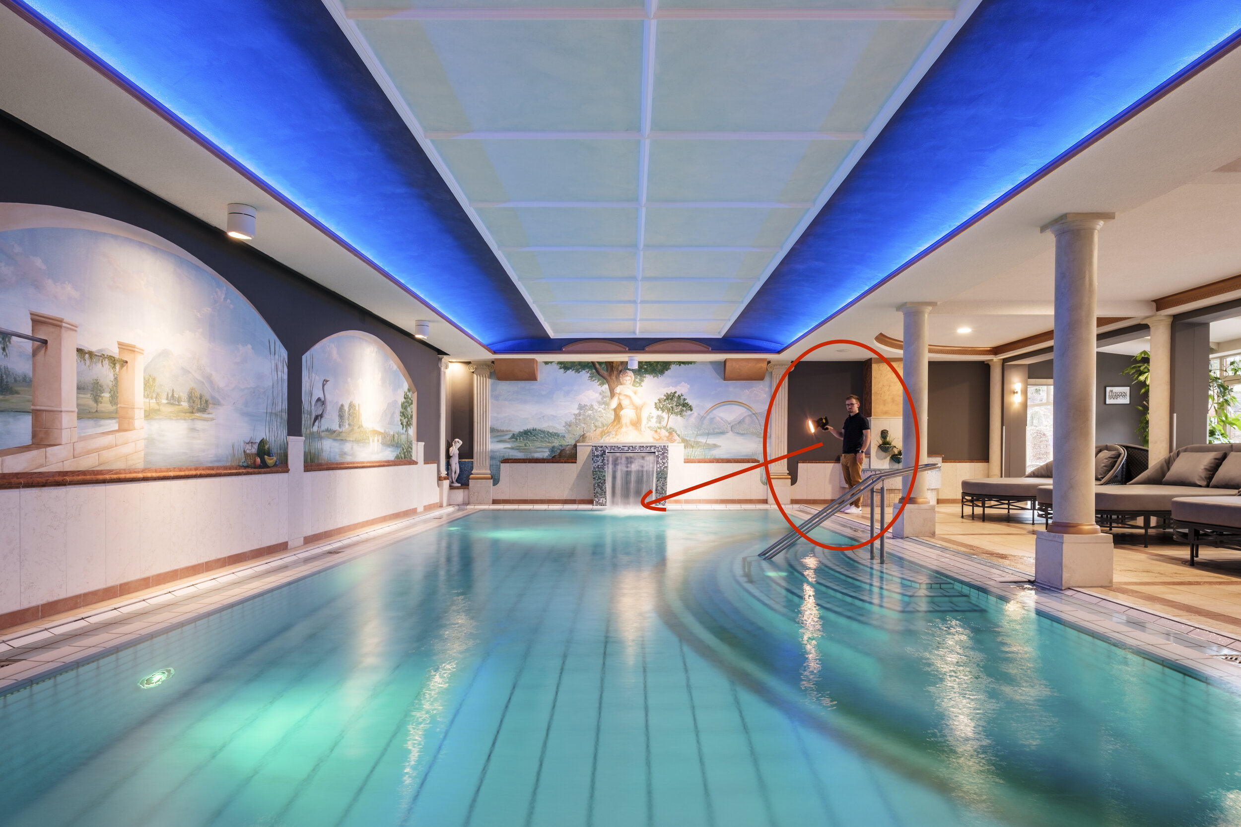
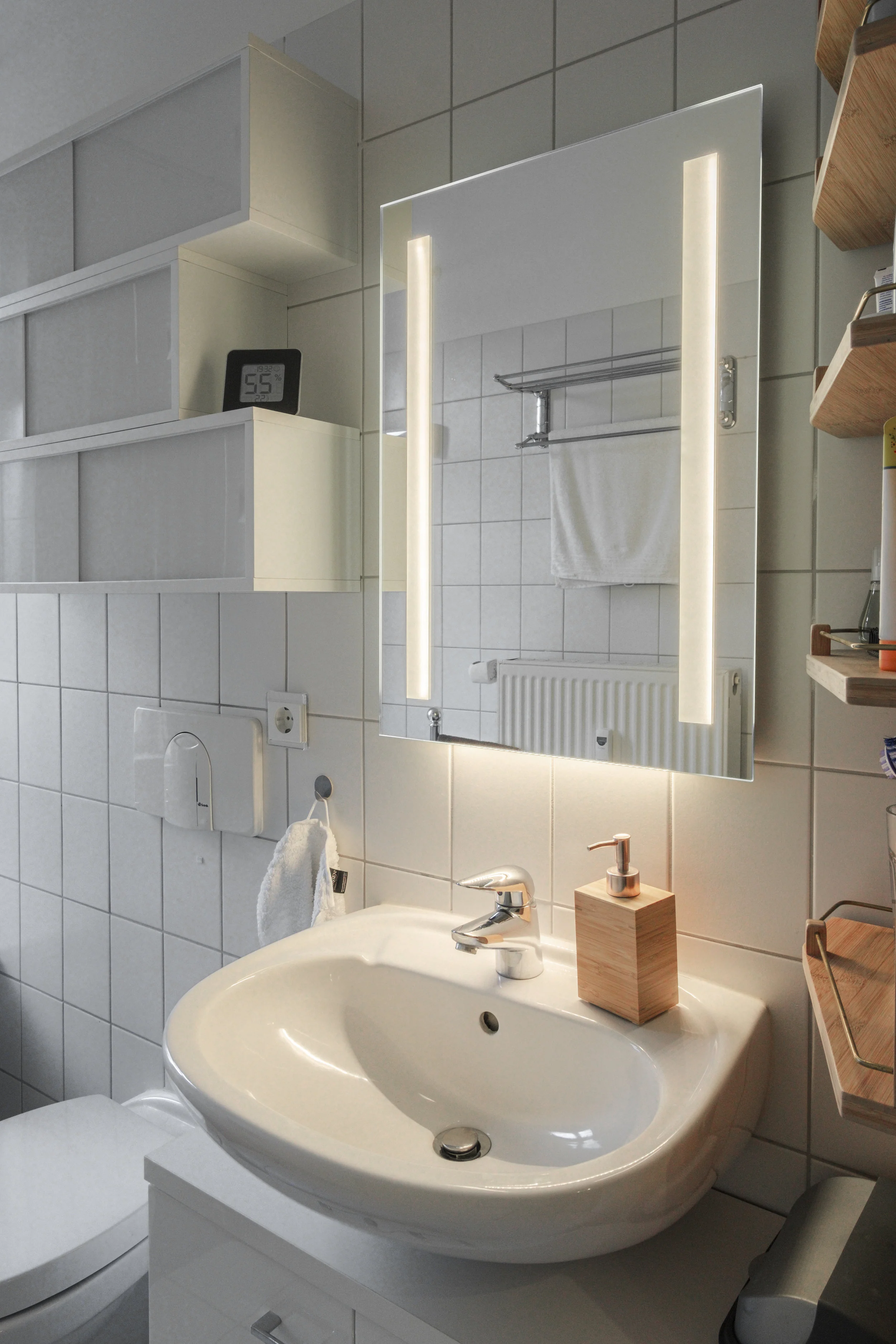
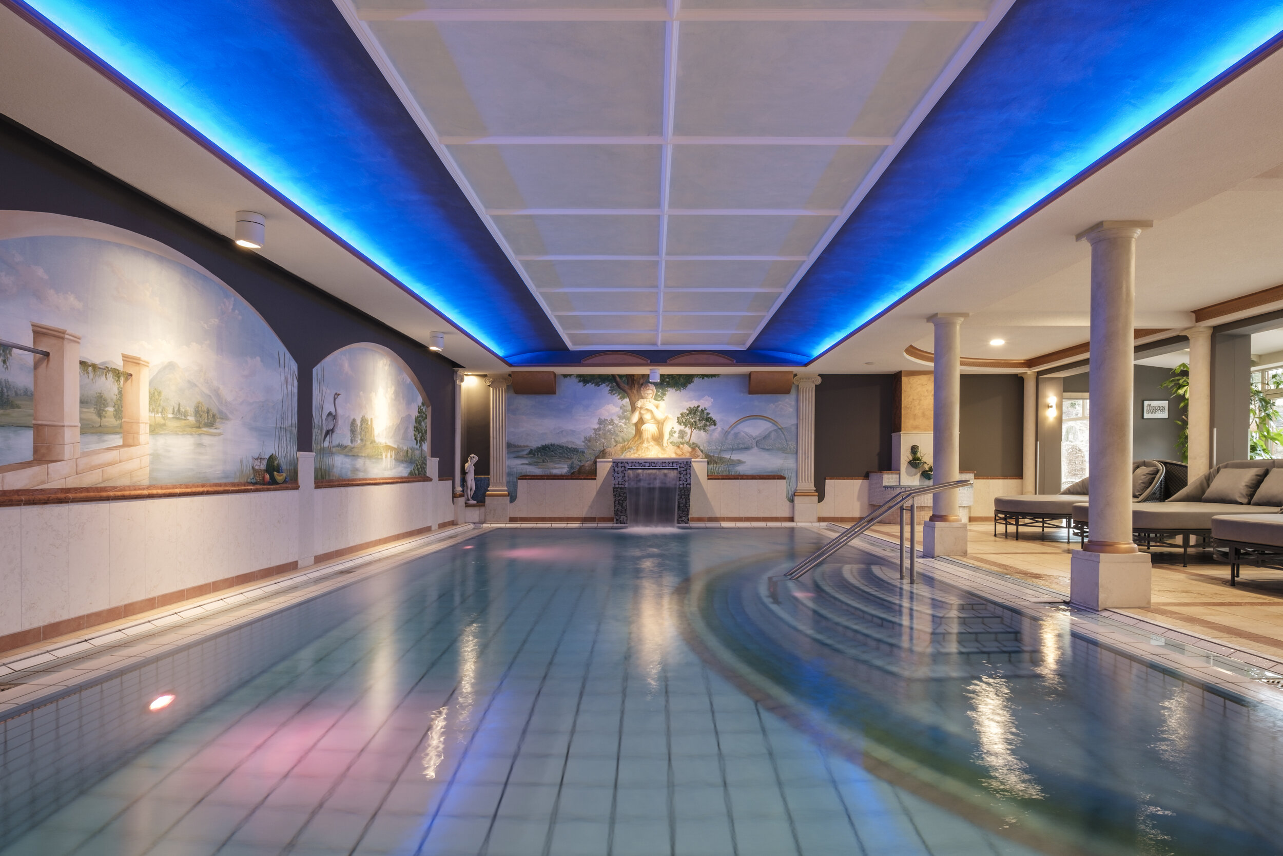
In this article, I am going to show you, how I use an LED-video light to light any sort of room in a luxurious hotel. To this shoot, I brought the Interfit Badger Beam 60w LED Video Lighting Monolight, with a Standard 18cm (7″) Reflector and a yellow CTO gel. The Badger Beam is a compact, light-weight and versatile 60W battery powered video & photo light that perfectly fits into my luggage to travel smart and super lightweight. With its 60 W power output, it provides a big amount of light that can be used in an ambient exposure lighting set-up, to add additional light to the ambient light emphasizing certain design elements of the room.

In this first scenario, I took two different shots:

1) An ambient shot with all interior lights turned on
2) A second shot with all interior lights turned on, including myself pointing the Badger beam light at the waterfall.

In Photoshop, I combined both images to have a perfectly lit picture, with a clearly visible and well-lit waterfall in the center of the frame that would have been way too dark without any additional light.
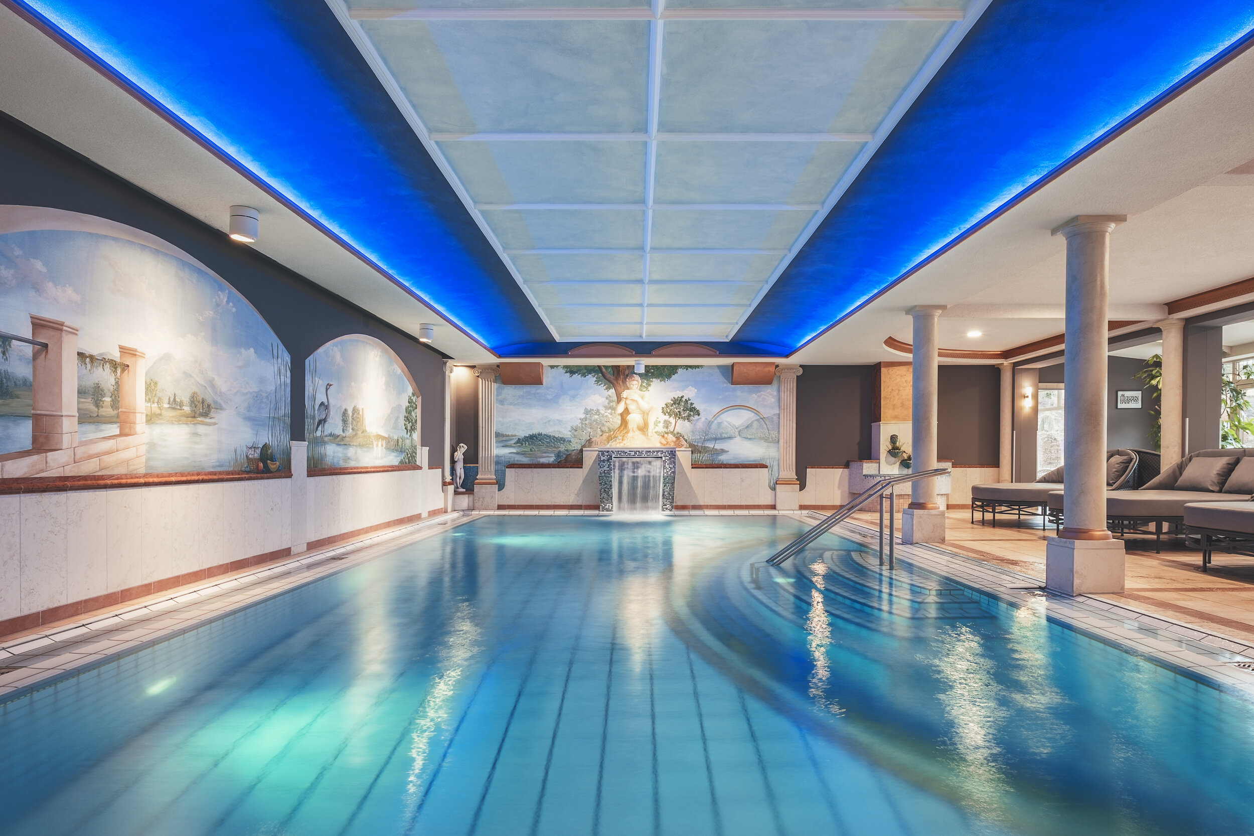
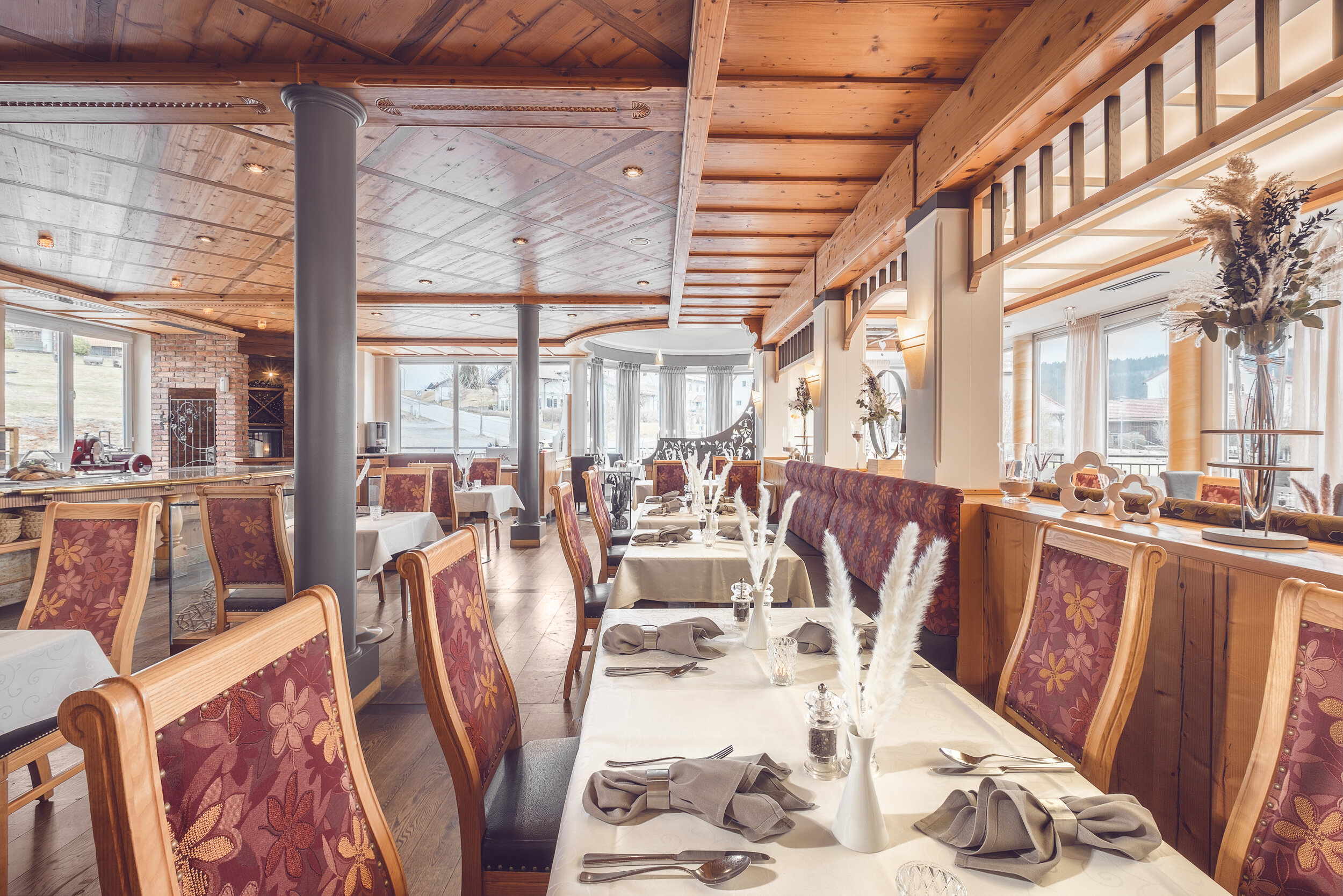
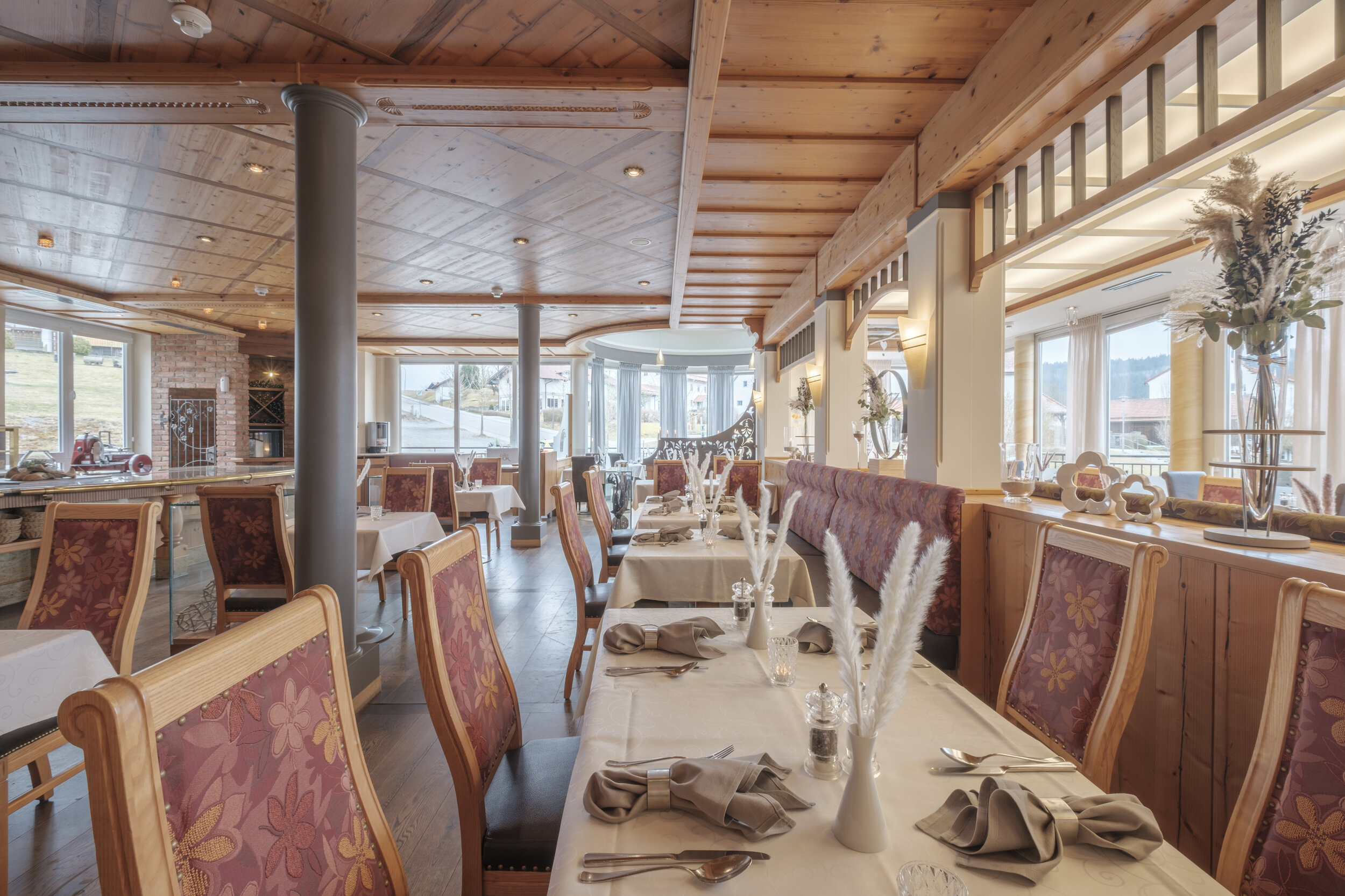
But not every scenario is that simple. There are way more different, more complex and more demanding scenarios in which you have to take way more single pictures. Those will all be layered in Photoshop again to create another well-lit restaurant interior photograph.
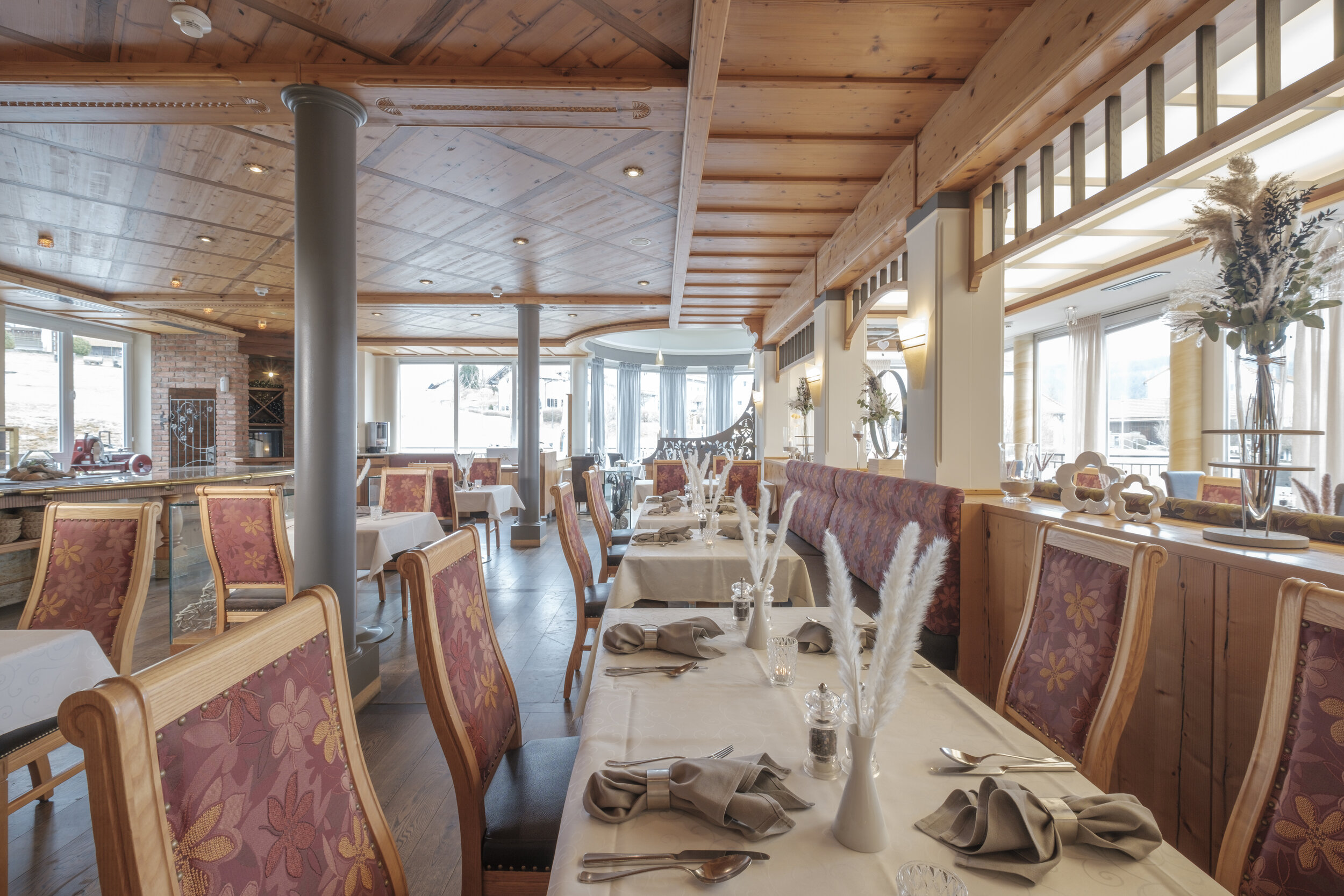
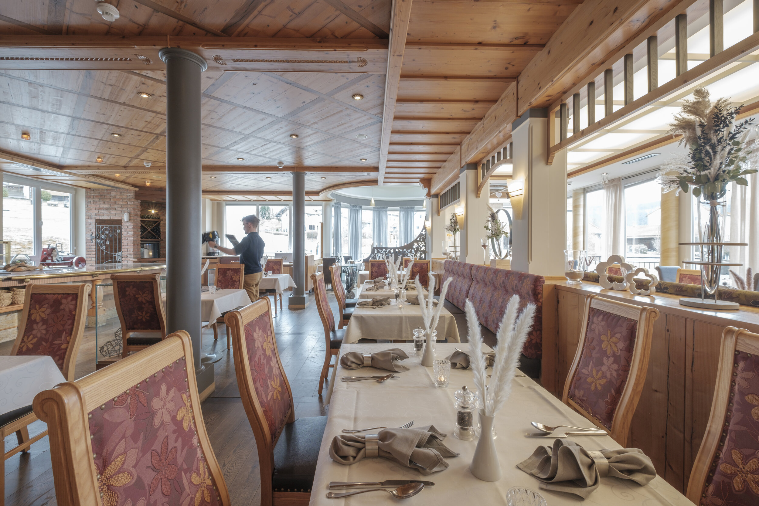
That way, I could improve the image from this basic poorly-lit shot to a well-lit interior photograph, showing all the highlights of the room in detail and in flattering light.

As we can see, it is way more important to plan your shots ahead than carrying many heavy flashes to your shoot. This way, it is much more convenient and time-saving on location as well as lighter and cheaper to light any hotel room you might run into. Layering multiple light-painted images in Photoshop also provides you with more flexibility in post-production to pick the best amount of light for each shot that you mask in to the base exposure.

IMG_5375.jpg

BTS - Behind the scenes - Good photography takes time: The importance of staging the scene.

At first, many people and hobby photographers might assume that interior photography is not that complex. You take your camera, mount it on a tripod and bring it into a space to shoot some long exposures. That’s how landscape photographers mostly do it. And yes, there are similarities, but as usual it is not that simple.

Common things of architectural and interior photography with landscape photography are that in most cases, you mount your camera onto a tripod, search for an interesting composition and take multiple exposures to merge them together into one final image. You mostly shoot with available light and fix some issues in Post-production. But despite all those similarities, there are two major differences in interior photography: Artificial lighting (if available light is not enough) mixing with natural light and staging.

Staging is the part that I would like to outline a bit in this article. In interiors, you cannot just simply expect that furniture is perfectly aligned and that all exposés are perfectly arranged. Even in real estate shoots, the realtor might tell you “Oh no, you don’t need to stage anything. We had already someone staging the house for our client.” Still, it has been staged for the eyes of people, who walk in and experience the entire space at the same time. This experience is missing when photographed. That’s where my job as a photographer comes in: I have to realign and rearrange the space to please the picture’s spectator, and to convey a message in my picture.

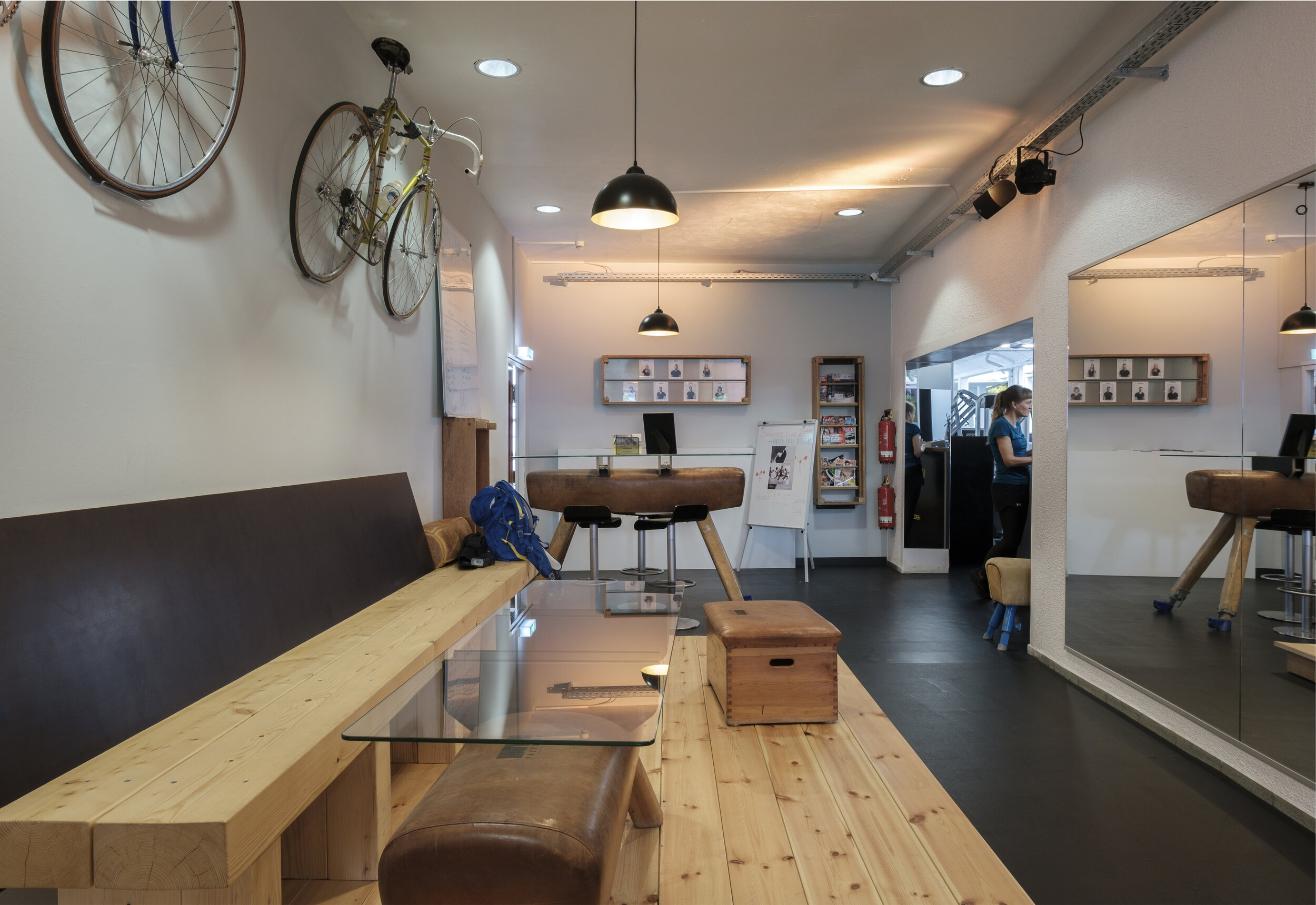
So, before I start the shoot, I scout the entire location and decide for my composition. Once I’ve locked it in, I start removing distractions - in the example below a backpack, a magnet board and a vaulting horse) - to declutter the scene, to separate the most important objects from each other and to remove unnecessary temporary items and installations.

In the next step, I align all the main elements - in the example below the glass table and the seat/box - before starting to add new elements to the scene. Before adding and bringing in new items and accessories, it is important to actually use only items that are available on-location and that add meaning to the scene at the same time.

In this case, I photographed the hangout area of a local gym. It is not that obvious in the beginning, as the bicycles are very untypical for gym and hence misleading the spectator. It could be a sports bar, a hip bicycle store or anything else. Of course, I made sure to implement the gym room into my composition (through the arch), but still I wanted to help the observer’s eye with a few more subtle hints figuring out that it is a gym or at least some sort of workout space. That’s why I asked for a branded towel and a bottle, which are compliant with the corporate design and identity. Then I also added a few drinks and a power bar from the fridge that you can purchase there.

That way, I killed three birds with one stone: I brought life into the otherwise empty and sterile space, I added meaning and some sort of human elements in a controlled way, and I also advertised products and merchandise purchasable at the gym.

All of this, took me at least 25 minutes before firing my first shot.
It drastically improved the image and saved me a lot of trouble in post-production.
Then, I still lit up different part of the rooms, took about 30 images and blended them manually together in Photoshop for two hours to one final piece. That’s why, good photography takes time and has its price.

Applying tiny house concepts to a suburban apartment. [EN/DE]

A while ago, I visited Dresden for the first time. The purpose of this trip, was to reconnect with my friends from Belgium, who had a stop-over at Dresden before continuing their journey through Europe. As this city is not that far away from Nuremberg, I decided to meet up there. After they had left, I took the opportunity to reconnect with another friend as well, who I remembered to live in Dresden.

Therefore he luckily invited me to his flat to present me the special features of his flat. He is actually the one and only person who introduced the tiny house concept to me. Tiny houses focus on using your living space efficiently, to cut costs for property and space, to declutter your life, get rid of things you don’t need and purchase high quality products that last lone. To maximize your living space, tiny house owners become very good at thinking outside the box, combining existing ideas to fit their own needs.

Michael, the owner of this apartment, did not build a tiny house, as he prefers to have a flat. Still, he could not hold back to take down walls, custom build his own furniture and create a completely unique living experience. In that process, he planned out everything in such detail that he almost did not waste any material, making this process environmentally friendly and cost-efficient. Really impressive! What’s even more impressive, is the invention of features he has never seen anywhere else in his research. I’ll outline that using the following overview picture of his kitchen. (Transformable elements are shown as translucent overlays):

He created a folding dining table with a folding chair on the side. Per-se that is nothing that special. But he did not like the “traditional” concept of having to use two hands to get his table ready. Hence, he created his own custom-built table that can be opened, closed and locked all in one hand movement; the chair as well, obviously. On the opposite side of the table, a second person can sit opposite to him on a wooden box that is also a storage at the same time.

On the right hand side, all his bottom-drawers are his own invention: You can pull them out, fold up the front board in one hand movement to be able to stand on top of it to reach his higher built wall shelves. That way, he can maximise the usage of vertical space, he’d otherwise be too small to reach it. He had to build those drawers in such a way that they do not break down from the guiding rail withstanding his whole bodyweight. (He’s a very thin guy, but it also withstood me).

Vor kurzem war ich zum ersten Mal in Dresden. Der Zweck dieser Reise war es, meine Freunde aus Belgien zu treffen, die einen Zwischenstopp in Dresden einlegten, bevor sie ihre Reise durch Europa fortsetzten. Da diese Stadt nicht weit von Nürnberg entfernt ist, habe ich beschlossen, mich dort mit ihnen zu treffen. Nachdem sie gegangen waren, nutzte ich die Gelegenheit, um mich auch mit einem anderen Freund seit langem wieder zu treffen.

Zum Glück hat er mich hierzu in seine Wohnung eingeladen, um mir die Besonderheiten seiner Wohnung vorzustellen. Er ist tatsächlich der einzige, der mir das Konzept von “Tiny houses” vorgestellt hat. Tiny houses konzentrieren sich darauf, den Wohnraum effizient zu nutzen, die Kosten für Grundstück und Raum zu senken, das Leben zu entmüllen und zu entspannen, Dinge loszuwerden, die man nicht benötigt, und qualitativ hochwertige Produkte zu kaufen, die lange halten. Um den Wohnraum zu maximieren, können Tiny house-Besitzer sehr gut über den Tellerrand hinaus schauen, quer denken um bekannte und bewährte Konzepte zu kombinieren und ihre eigenen Bedürfnisse anzupassen.

Michael, der Besitzer dieser Wohnung, hat kein tiny house gebaut, da er lieber in einer Wohnung wohnen möchte. Trotzdem konnte er sich nicht zurückhalten, einige Wände einzureißen, seine eigenen Möbel nach Maß zu bauen und ein völlig einzigartiges Wohnerlebnis zu schaffen. Dabei plante er alles so detailliert, dass er fast kein Material verschwendete, was diesen Prozess umweltfreundlich und kosteneffizient machte. Sehr beeindruckend! Noch beeindruckender ist die Erfindung eigener Konzepte, die er in seiner Recherche zuvor noch nie gesehen hat. Ich werde das anhand des folgenden Übersichtsbilds seiner Küche skizzieren. (Transformierbare Elemente werden als durchsichtige Überlagerungen dargestellt.)

Er baute einen klappbaren Esstisch mit einem Klappstuhl an der Seite. An sich ist das nichts Besonderes, aber das bisherige Konzept, mit zwei Händen seinen Tisch aufklappen zu müssen, gefiel ihm nicht. Daher baute er seinen eigenen maßgeschneiderten Tisch, der mit einer Handbewegung geöffnet und geschlossen und werden kann und dabei einzurasten; der Stuhl natürlich auch. Auf der gegenüberliegenden Seite des Tisches kann eine zweite Person gegenüber auf einer Holzkiste sitzen, die gleichzeitig auch als Stauraum dient.

Auf der rechten Seite sind alle seine unteren Schubladen seine eigene Erfindung: Er kann sie herausziehen, das vordere Brett mit einer Handbewegung hochklappen, um darauf zu stehen und zu den höher gebauten Wandregalen zu gelangen. Auf diese Weise kann er die Nutzung des vertikalen Raums maximieren. Andernfalls wäre er zu klein, um ihn zu erreichen. Er musste diese Schubladen so bauen, dass sie trotz seines gesamten Körpergewichts nicht von der Führungsschiene abrutschen oder -brechen. (Er wiegt nicht viel, aber es hat auch mich ausgehalten).

Swivelling the drawer front board.

Swivelling the drawer front board.

Taking a look on the inside of the drawers, we can also see his passion and dedication to use the space he has efficiently. He created cutouts around the syphon and bought bowls that he could perfectly place inside of the drawer. (Pic 1) His love for details, labelling and order is clearly visible in (Pic 2), where we can see a two-level drawer — or in other words: the top level can be removed to access the one below (wooden handle bar) — with perfectly aligned and labelled spices. Similarly, he created a horizontal tea rack (Pic 3). He still had other unique ideas, as we can see in (Pic 4) where he bought perfectly sized pots and pans so that the diameter of their lids allowed them to be stored separately in the same drawer. Very clever! I love those details!

Bei einem Blick ins Innere der Schubladen können wir auch seine Leidenschaft und Hingabe sehen, den Raum, den er hat, effizient zu nutzen. So baute er Schubladen mit Ausschnitten, die sich genau um den Siphon der Spüle legten und kaufte Schüsseln, die er perfekt in die Schublade stecken konnte (Bild 1). Seine Liebe zum Detail, zur Beschriftung und zur Ordnung zeigt sich deutlich in (Bild 2), wo wir eine Schublade mit zwei Ebenen sehen können - oder mit anderen Worten: Die oberste Ebene kann entfernt werden, um auf die darunterliegende zuzugreifen (Holzgriff) - mit perfekt ausgerichteten und etikettierten Gewürzen. Ebenso baute er sich ein horizontales Teeregal (Bild 3). Er hatte noch andere einzigartige Ideen, wie wir in (Bild 4) sehen können, wo er Töpfe und Pfannen in perfekter Größe kaufte, so dass der Durchmesser ihrer Deckel es ermöglichte, sie separat in derselben Schublade zu lagern. Genial! Ich liebe diese Details!

Not only the storage, but also the work space has been maximized by Michael. He created his custom cutting board, so that he could cut his vegetables right next to the pots heating up on the rear hotplates, while safely covering the front hotplates and still being able to access all controls of the stove.

Nicht nur der Stauraum, sondern auch der Arbeitsbereich wurde von Michael maximiert. Er schuf sein maßgeschneidertes Schneidebrett, damit er sein Gemüse direkt neben den Töpfen schneiden konnte, die auf den hinteren Kochplatten aufheizten, während er die vorderen Kochplatten sicher bedeckte und trotzdem auf alle Bedienelemente des Ofens zugreifen konnte.

Dresden_2019_MTD_793-Edit.jpg

In the adjacent living area, his coffee table could be used in many appliances as well:
He could put it on one side to keep it right next to him for reading, having a snack and a tea, without having to lean forward or backwards. If he has guests, he can still use it in an ordinary way, placing it just in front of everyone sitting on the couch. In a third scenario he could lay down his legs and still access his drinks and snacks with his legs below the table. Just on a side note, the table on the side (pun intended) is a custom product imported from Canada that can be easily extended to comfortably fit 10 people on one dining table.

Im angrenzenden Wohnbereich kann sein Couchtisch auch für viele andere Geräte verwendet werden: Er kann ihn auf eine Seite stellen, um ihn zum Lesen zu nutzen, seinen Snack und einen Tee direkt neben sich zu haben, ohne sich vor- oder zurücklehnen zu müssen. Wenn er Gäste hat, kann er ihn immer noch auf gewöhnliche Weise benutzen, indem er ihn direkt vor alle stellt, die auf der Couch sitzen. In einem dritten Szenario konnte er sich hinlegen und trotzdem mit den Beinen unter dem Tisch auf seine Getränke und Snacks zugreifen. Nur als Randnotiz: Der Tisch am Rand (—jaa, schlechtes Wortspiel) ist ein aus Kanada importiertes Sonderprodukt, das problemlos erweitert werden kann, um 10 Personen bequem an einen Esstisch zu setzen

Dresden_2019_MTD_1004-HDR-Edit.jpg

In the end of his home tour he showed me his tiny bathroom, with custom built shelves with hand-made rails. I really like that he does not only build everything by himself and on a low-budget, but even more pays attention to such little details that are pretty and useful at the same time.

Am Ende seiner Wohnungsführung zeigte er mir sein kleines Badezimmer mit maßgefertigten Regalen und handgefertigten Schienen. Ich mag es wirklich, dass er nicht nur alles selbst und mit geringem Budget baut, sondern noch dazu auf solche kleinen Details achtet, die gleichzeitig hübsch und nützlich sind.

I really enjoyed to see Michael, applying tiny house concepts I knew before in a unique way that perfectly match his needs. For the first time, I could experience them live myself and not just watch a youtube video. I’d love to see and photograph more of that in the near future.

Ich habe es wirklich genossen, Michael zu sehen und winzige Hauskonzepte, die ich vorher kannte, auf eine einzigartige Weise anzuwenden, die perfekt zu seinen Bedürfnissen passt. Zum ersten Mal konnte ich sie selbst live erleben und nicht nur ein YouTube-Video ansehen. Ich würde gerne in naher Zukunft mehr davon sehen und fotografieren.

Top