BTS - Behind the scenes - Good photography takes time: The importance of staging the scene.

At first, many people and hobby photographers might assume that interior photography is not that complex. You take your camera, mount it on a tripod and bring it into a space to shoot some long exposures. That’s how landscape photographers mostly do it. And yes, there are similarities, but as usual it is not that simple.

Common things of architectural and interior photography with landscape photography are that in most cases, you mount your camera onto a tripod, search for an interesting composition and take multiple exposures to merge them together into one final image. You mostly shoot with available light and fix some issues in Post-production. But despite all those similarities, there are two major differences in interior photography: Artificial lighting (if available light is not enough) mixing with natural light and staging.

Staging is the part that I would like to outline a bit in this article. In interiors, you cannot just simply expect that furniture is perfectly aligned and that all exposés are perfectly arranged. Even in real estate shoots, the realtor might tell you “Oh no, you don’t need to stage anything. We had already someone staging the house for our client.” Still, it has been staged for the eyes of people, who walk in and experience the entire space at the same time. This experience is missing when photographed. That’s where my job as a photographer comes in: I have to realign and rearrange the space to please the picture’s spectator, and to convey a message in my picture.

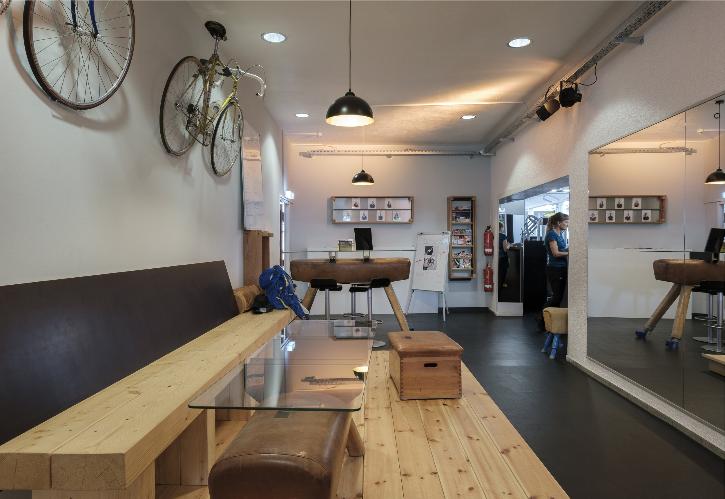
So, before I start the shoot, I scout the entire location and decide for my composition. Once I’ve locked it in, I start removing distractions - in the example below a backpack, a magnet board and a vaulting horse) - to declutter the scene, to separate the most important objects from each other and to remove unnecessary temporary items and installations.

In the next step, I align all the main elements - in the example below the glass table and the seat/box - before starting to add new elements to the scene. Before adding and bringing in new items and accessories, it is important to actually use only items that are available on-location and that add meaning to the scene at the same time.

In this case, I photographed the hangout area of a local gym. It is not that obvious in the beginning, as the bicycles are very untypical for gym and hence misleading the spectator. It could be a sports bar, a hip bicycle store or anything else. Of course, I made sure to implement the gym room into my composition (through the arch), but still I wanted to help the observer’s eye with a few more subtle hints figuring out that it is a gym or at least some sort of workout space. That’s why I asked for a branded towel and a bottle, which are compliant with the corporate design and identity. Then I also added a few drinks and a power bar from the fridge that you can purchase there.

That way, I killed three birds with one stone: I brought life into the otherwise empty and sterile space, I added meaning and some sort of human elements in a controlled way, and I also advertised products and merchandise purchasable at the gym.

All of this, took me at least 25 minutes before firing my first shot.
It drastically improved the image and saved me a lot of trouble in post-production.
Then, I still lit up different part of the rooms, took about 30 images and blended them manually together in Photoshop for two hours to one final piece. That’s why, good photography takes time and has its price.

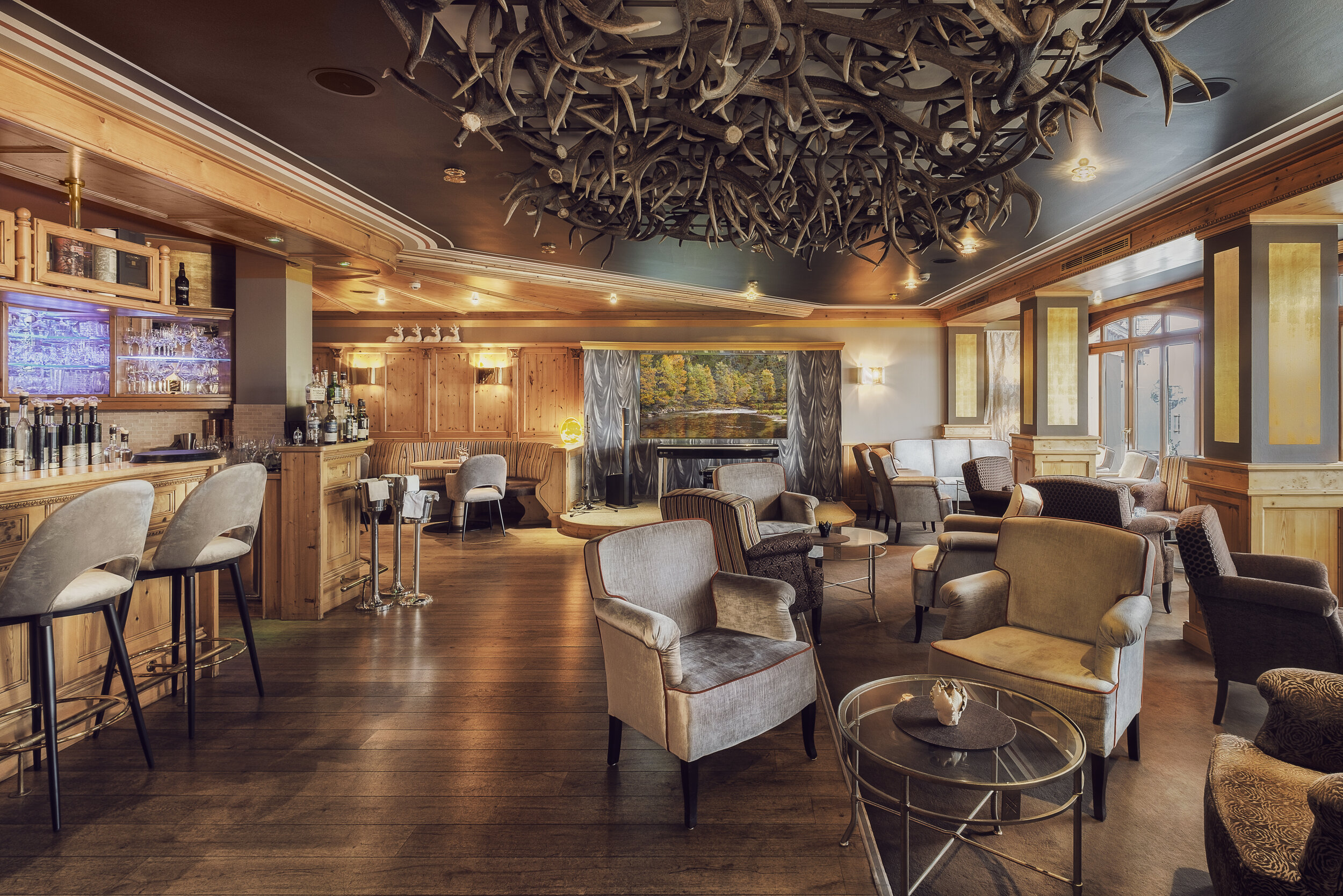
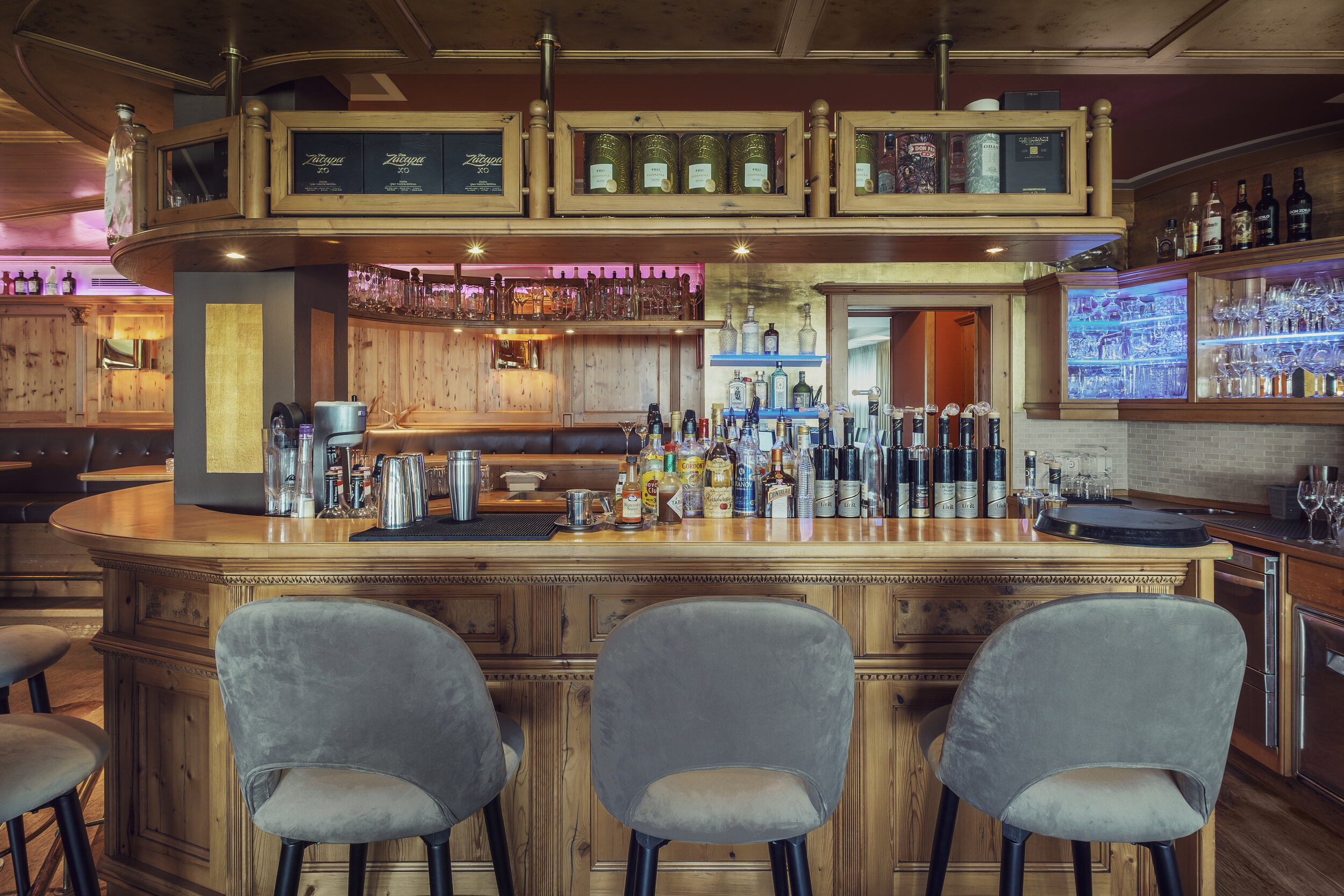
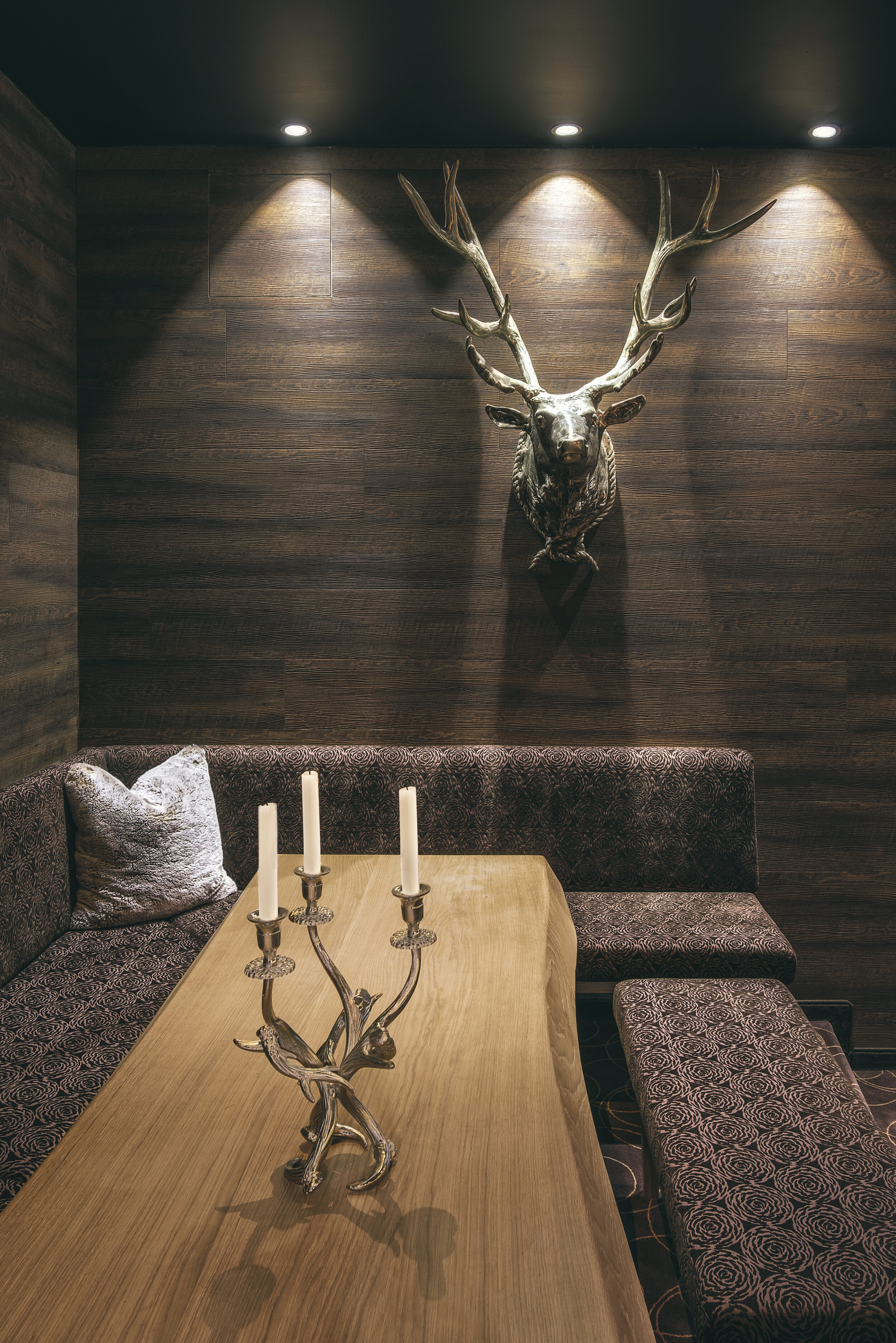
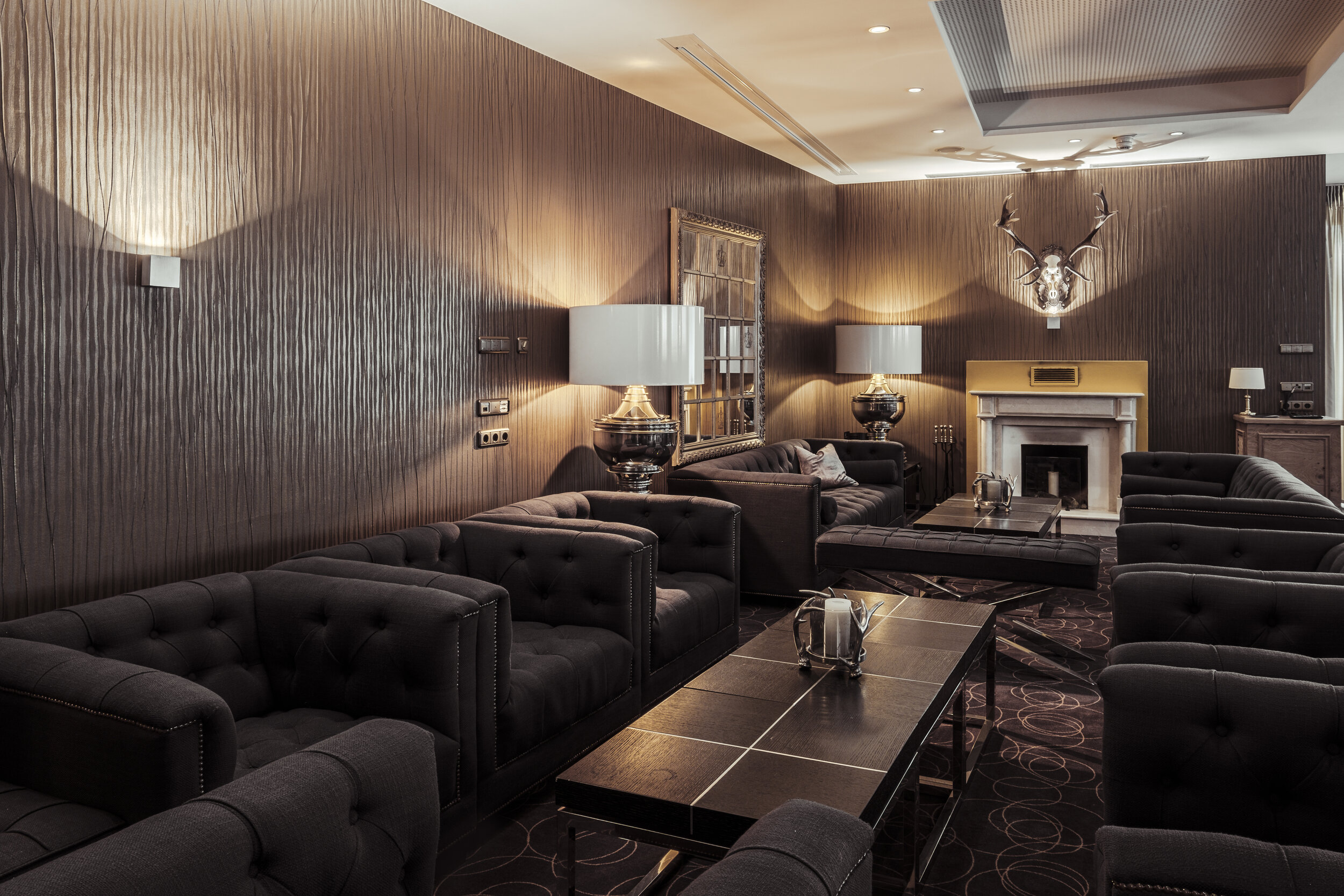
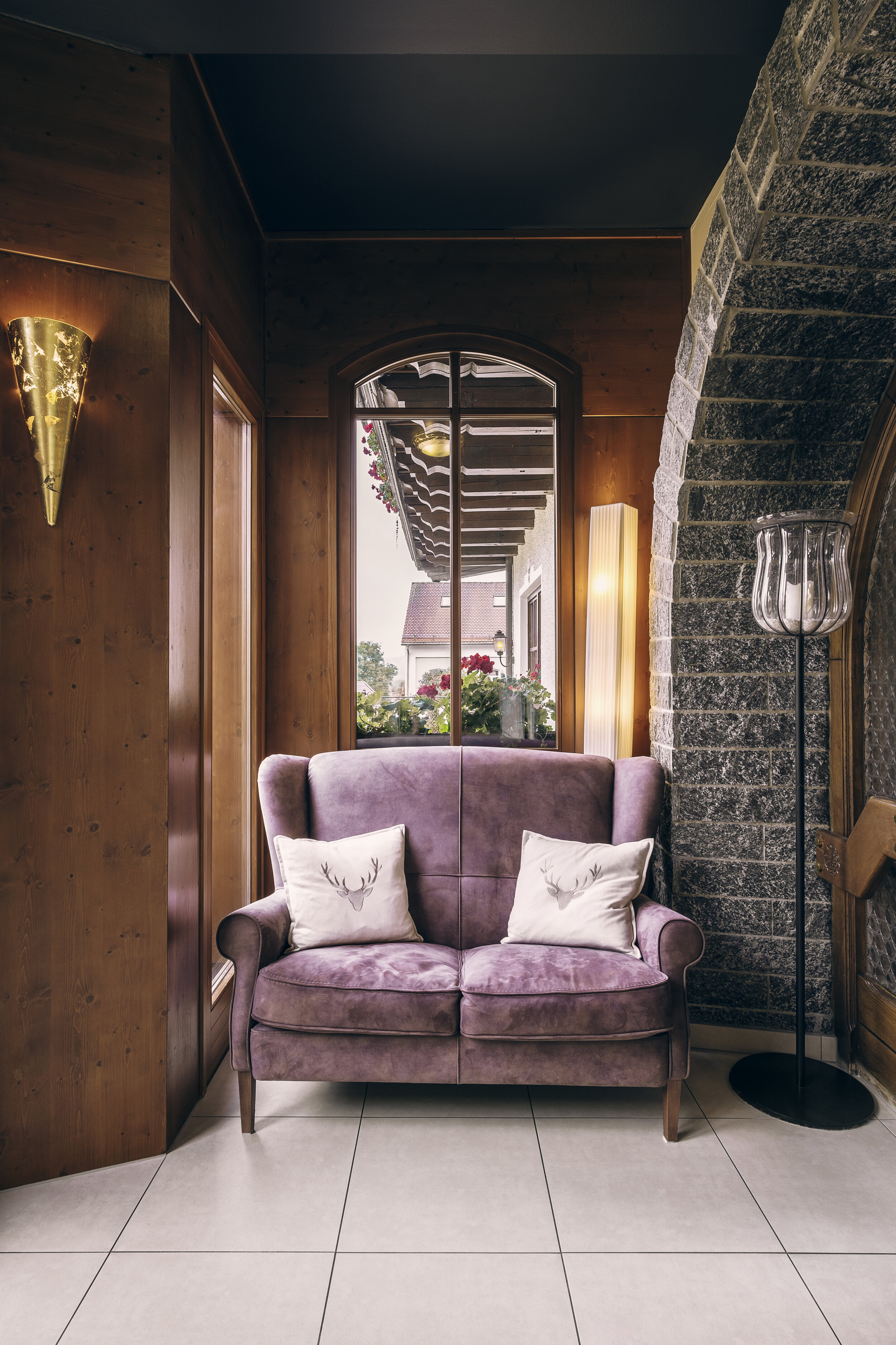
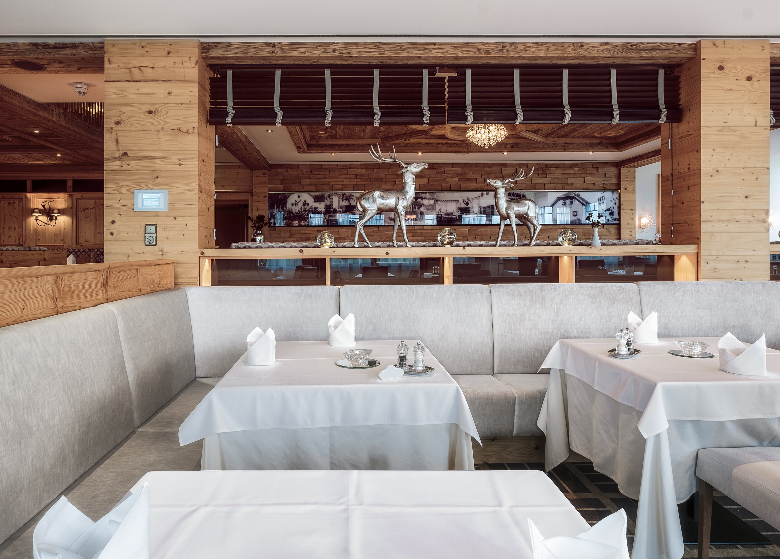
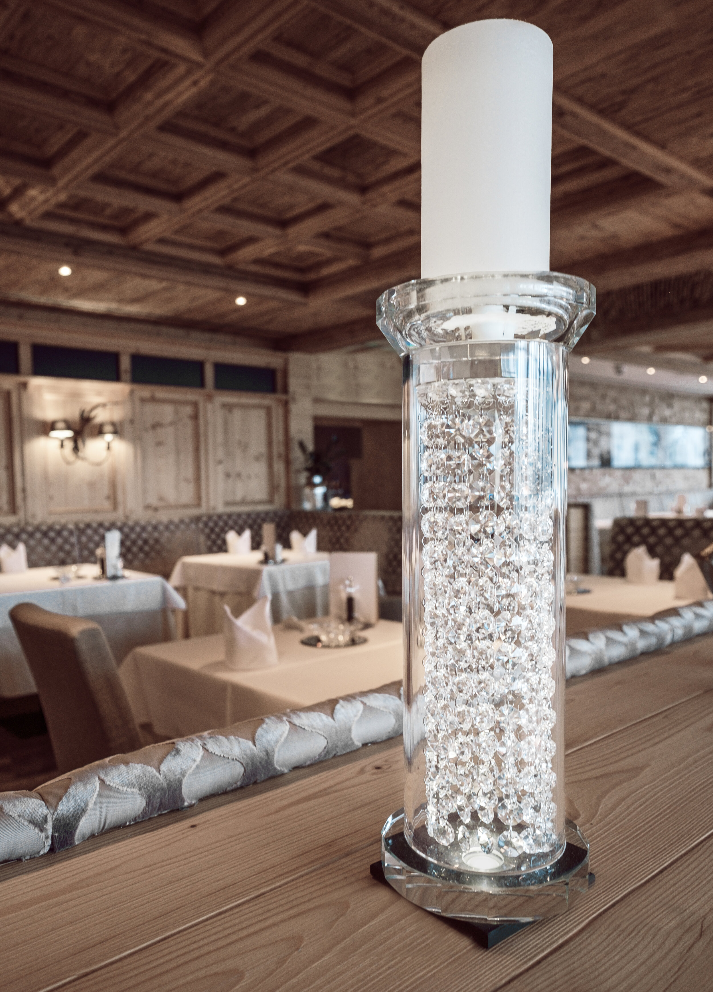
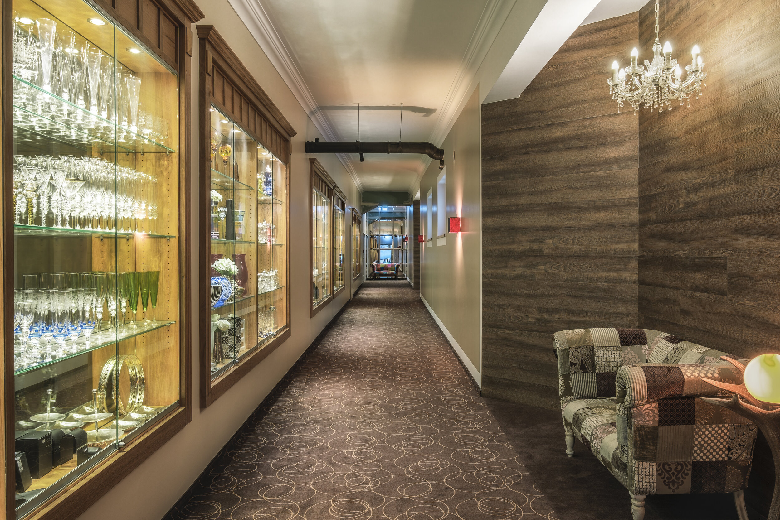
4*s Relais & Châteaux Landromantik Hotel Oswald | Kaikenried | Germany

I just recently stayed at the most beautifully designed Hotel I have ever stayed at. And not only was it well designed and looked pretty, but also the food was outstanding. I' have never eaten such great food! I stayed for two nights (full-board residential) so I could enjoy all day long the awarded cuisine of this fantastic hotel. The Michelin star was definitely deserved. I participated in the breakfast with omelettes on demand, juices, prosecco, sweet pastries, meat, cheese, granola, fruits and anything else you could possibly imagine. I was even still so full that I did not participate in the afternoon snack. And to conclude an entire day of full relaxation in the beautiful spa with many saunas, steam baths and two pools (one indoor, one on the rooftop), I enjoyed a 6 course dining menu. Before leaving to my room, I ordered a cocktail at the beautifully designed bar, where I could relax, listen to music and mingle with the bartender and other hotel guests. A perfect stay.
Oh well, and of course, I did not miss the opportunity to capture some pictures of this amazing hotel interior.

Photographing the Climbing Factory | Nürnberg | Germany

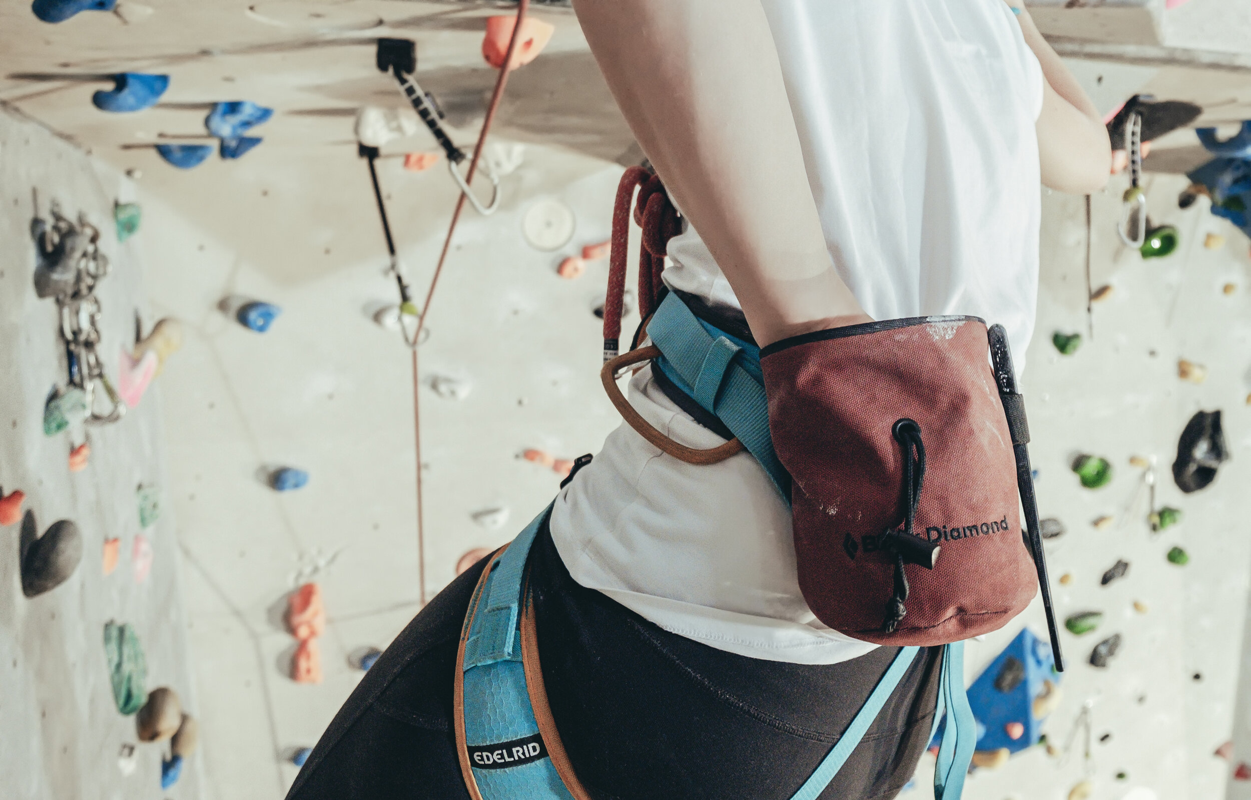
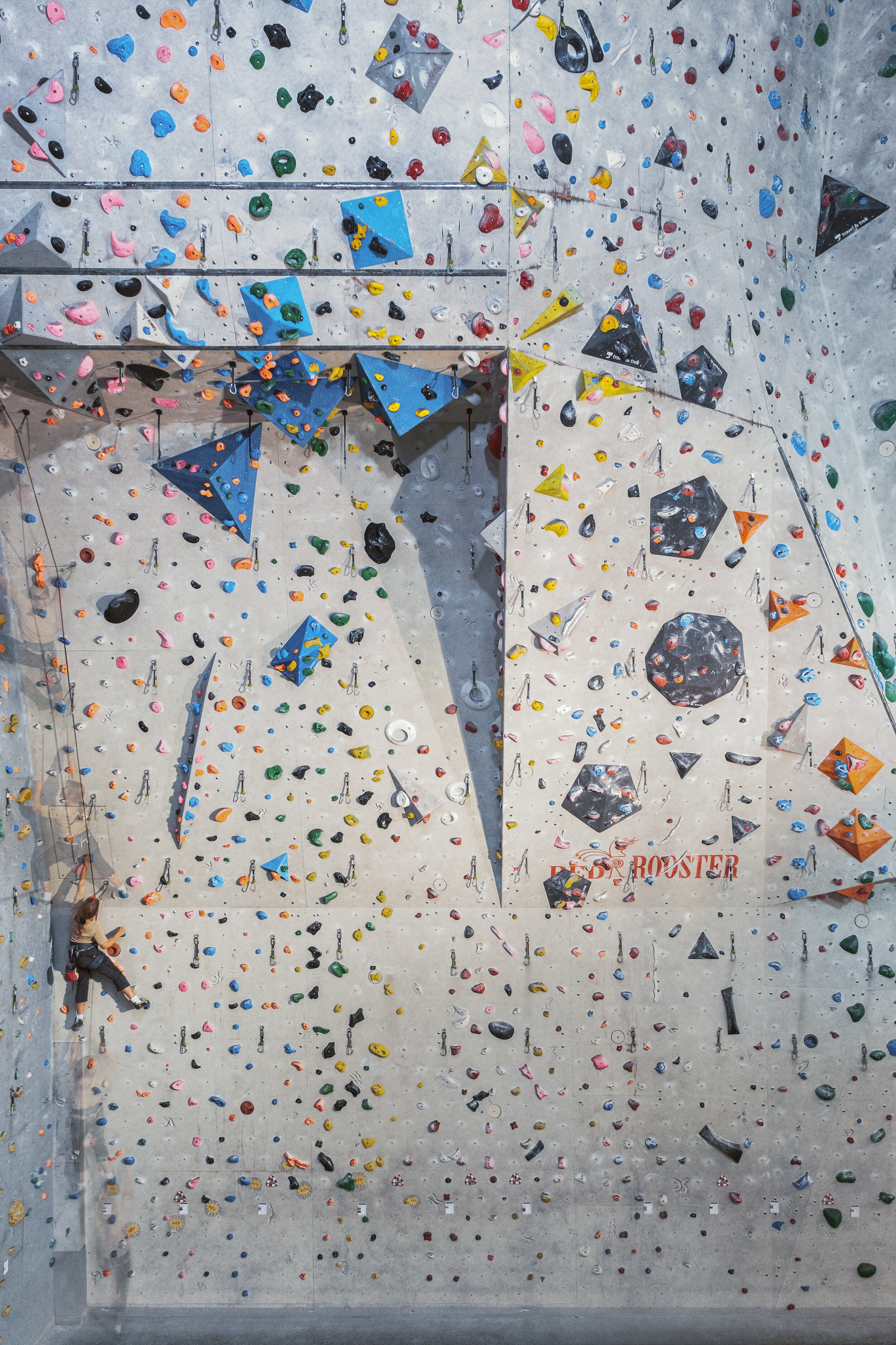
[EN] For the last week, I was hired by the Climbing Factory Nürnberg to create new images for their website revamp and their social media platforms. The first task sounded to be quite simple “Create a panoramic image that shows the entire wall”. But unfortunately, it was almost impossible due to the shared space with an adjacent fitness centre. Due to that, the 2 metres high walls separating the climbing hall and the fitness center, blocked the right part of the climbing hall. In the end, we decided to not overcomplicate things and create a single wide angle shot in landscape orientation. Once this task was completed, I created a lifestyle imagery series of two climbers hanging and climbing in the wall.


In order to do that, I first had to climb up myself a wall of the level 6+. Then one of the climbers climbed up with my camera gear. From there, I was hanging in the wall and shooting most of the images below. It was really an interesting and exciting experience, having this entirely new photographic perspective. Only in the beginning, I was a bit terrified, to drop my camera or the attached flash light. But those fears were completely unfounded. I really had a blast and look forward to my next extreme shooting situation!

Below are not all, but my favourite shots from this shoot.

➤➤➤Click on the photographs for full-size.

[DE] Im Laufe der letzten Woche wurde ich von der Climbing Factory Nürnberg engagiert, um neue Bilder für ihre Website und ihre Social-Media-Plattformen zu erstellen. Die erste Aufgabe klang zunächst relativ simpel: „Mache ein Panoramabild, das die gesamte Wand zeigt“. In Realität war das jedoch gar nicht so leicht, da der Raum gleichzeitig mit einem Fitnessstudio geteilt wird. Aus diesem Grund versperrten die 2 Meter hohen Wände, die die Kletterhalle und das Fitnesscenter voneinander trennten, den rechten Teil der Kletterhalle.

Am Ende haben wir beschlossen, die Dinge nicht künstlich komplizierter zu machen und stattdessen eine einzige Weitwinkelaufnahme im Querformat zu erstellen. Danach kam der spaßige und aufregende Teil: Eine Lifestyle-Bilderserie mit zwei Kletterern, die in der Wand hängen und klettern. Dazu musste ich zunächst selbst die Wand entlang einer 6+ Stufe erklimmen. Natürlich brauchte ich auch meine Kamera, die mir wenig sptäer von dem Kletterer nach oben gebracht wurde. Dort hing ich dann für einige Zeit gesichert in der Wand und fotografierte. Es war wirklich eine interessante und aufregende Erfahrung, eine völlig neue fotografische Perspektive aus der Höhe zu haben. Erst am Anfang hatte ich ein bisschen Angst, meine Kamera oder das angebrachte Blitzlicht fallen zu lassen. Aber diese Angst war völlig unbegründet. Ich hatte wirklich viel Spaß und freue mich auf mein nächstes extremes Shooting!

Unten sind bei weitem nicht alle, aber dafür meine Lieblingsbilder des Shoots.

➤➤➤Fotos anklicken für Vollansicht.

02.10.2019_2019_MTD_73-Edit.jpg
Top