fotograf

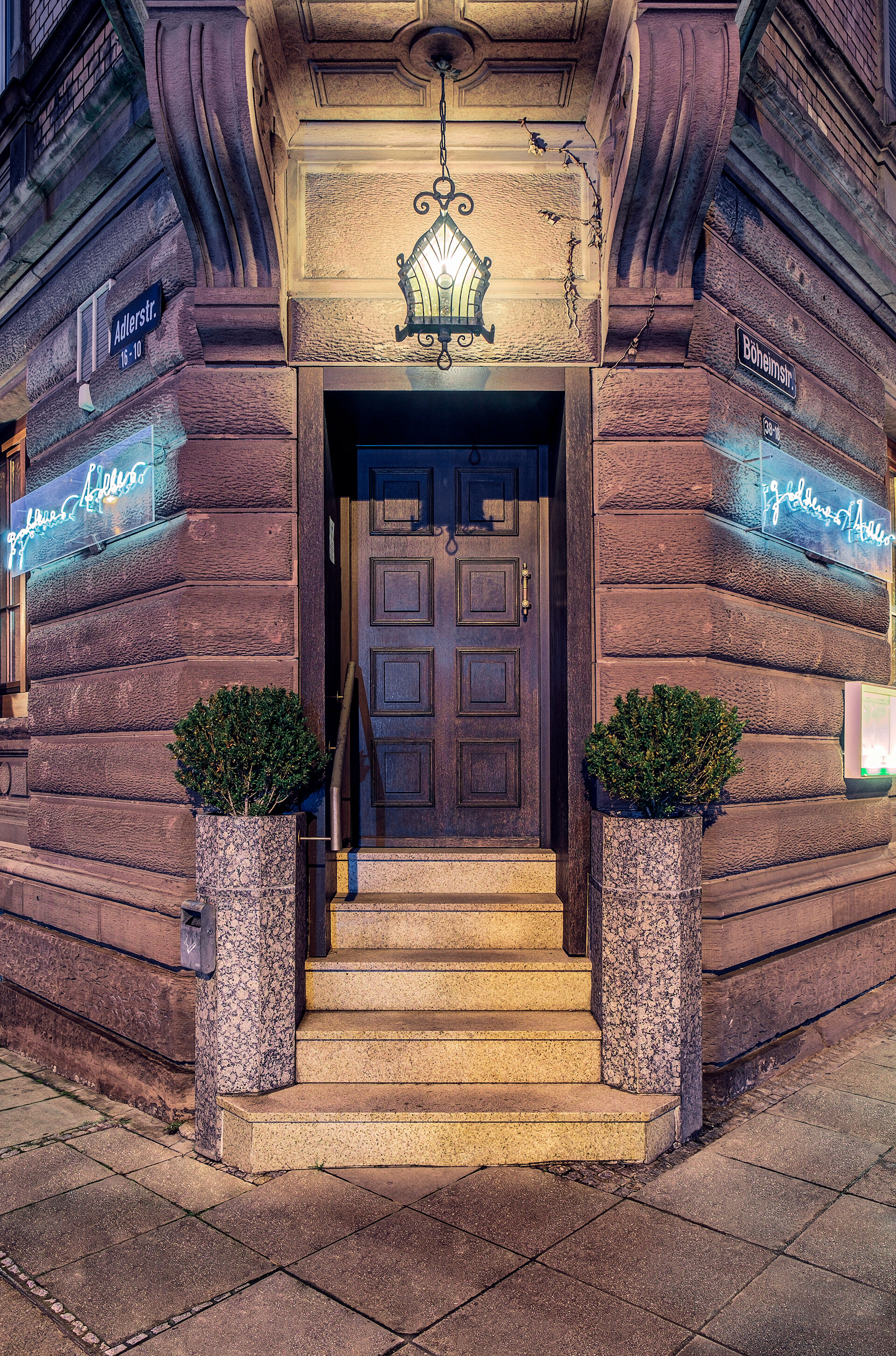
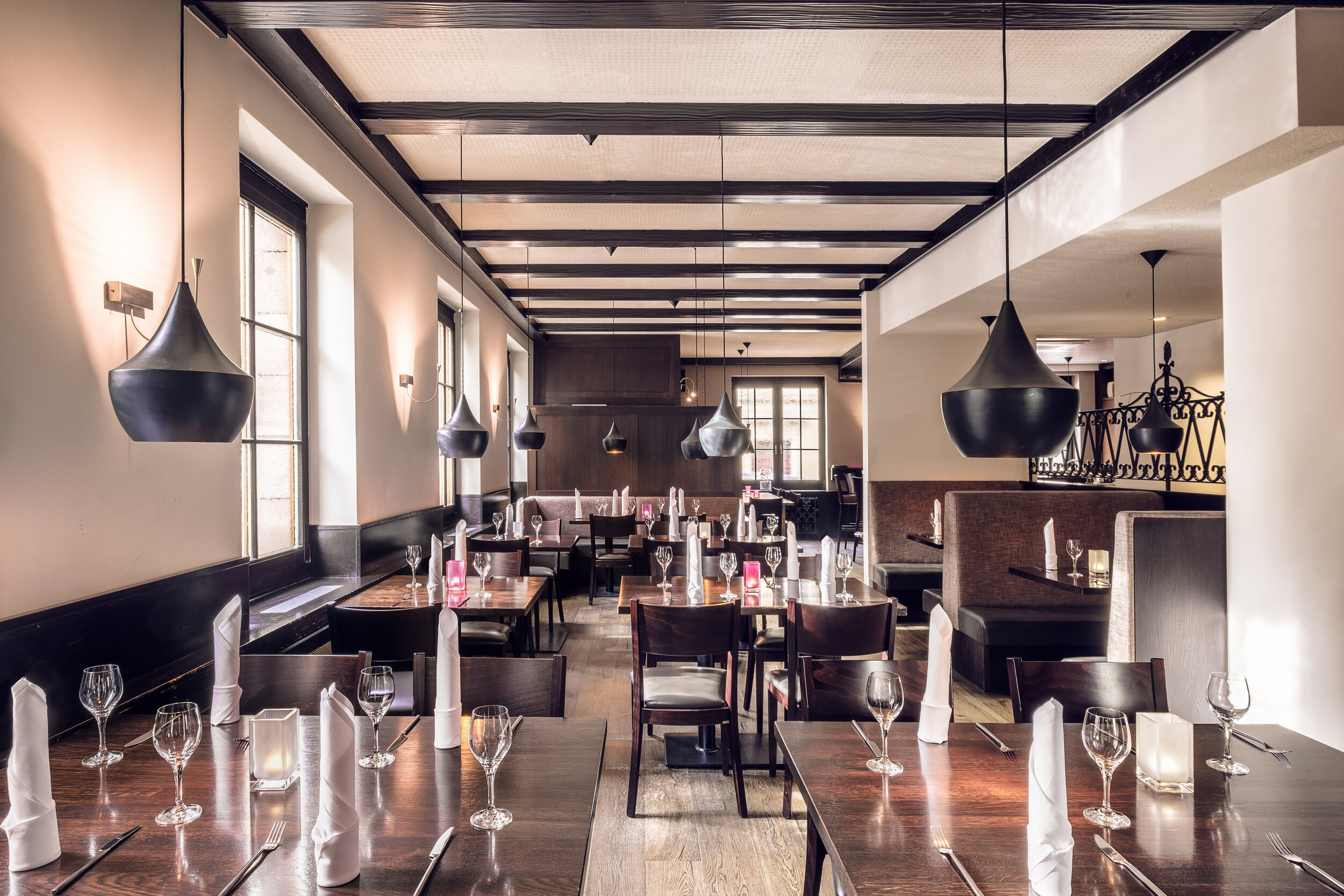
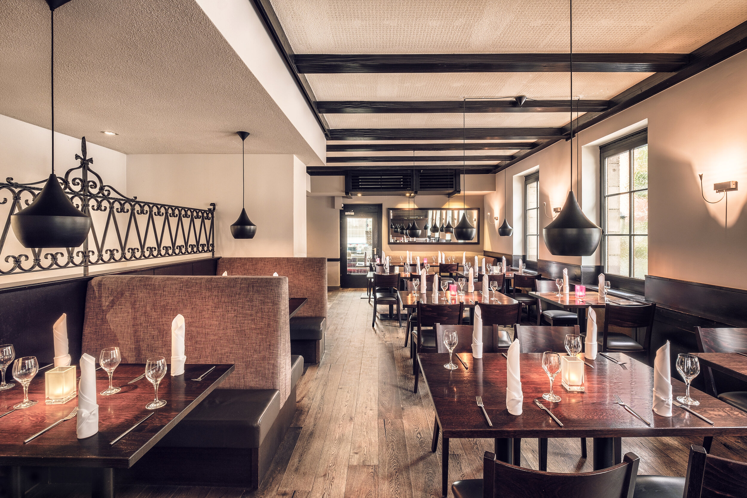
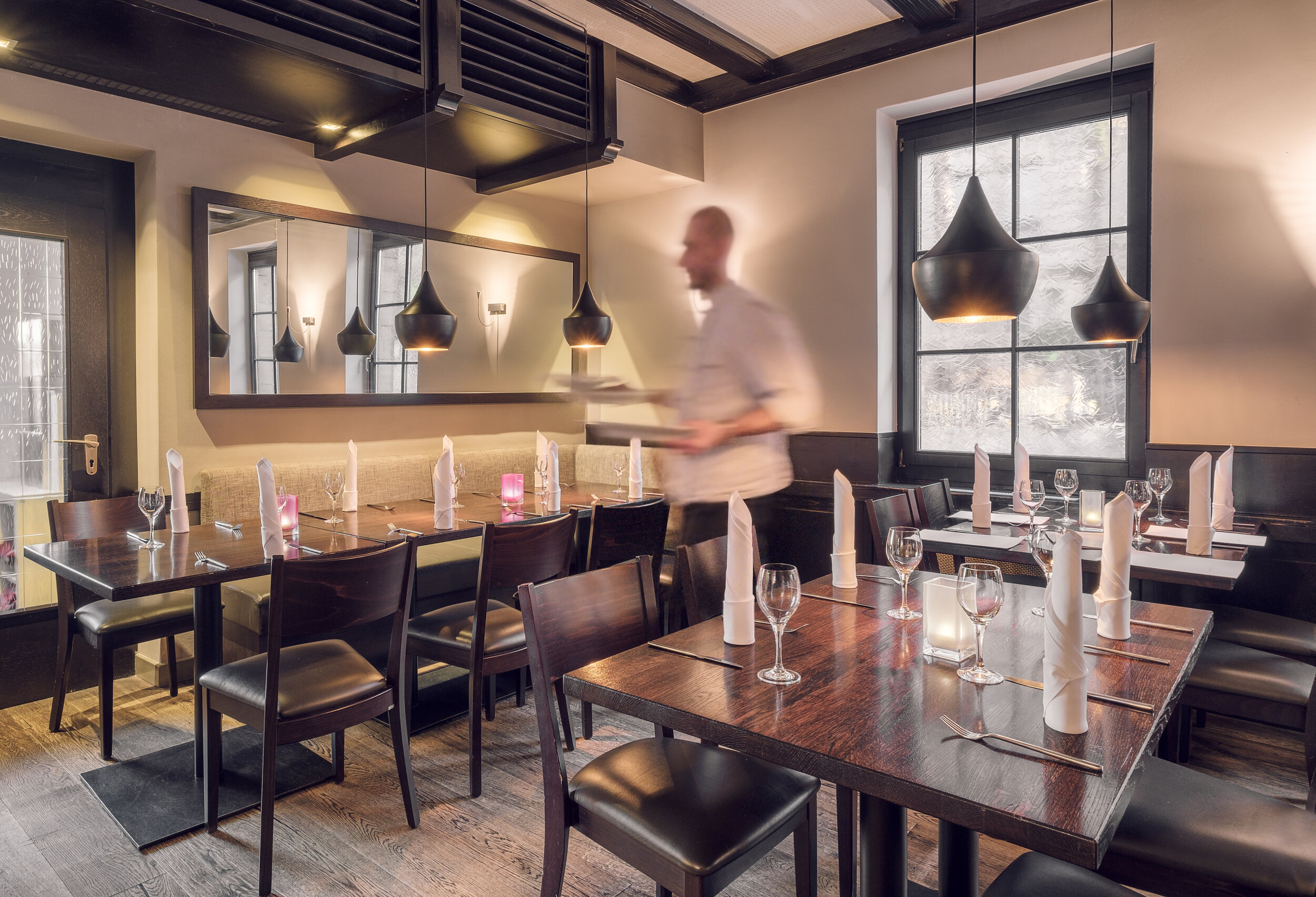
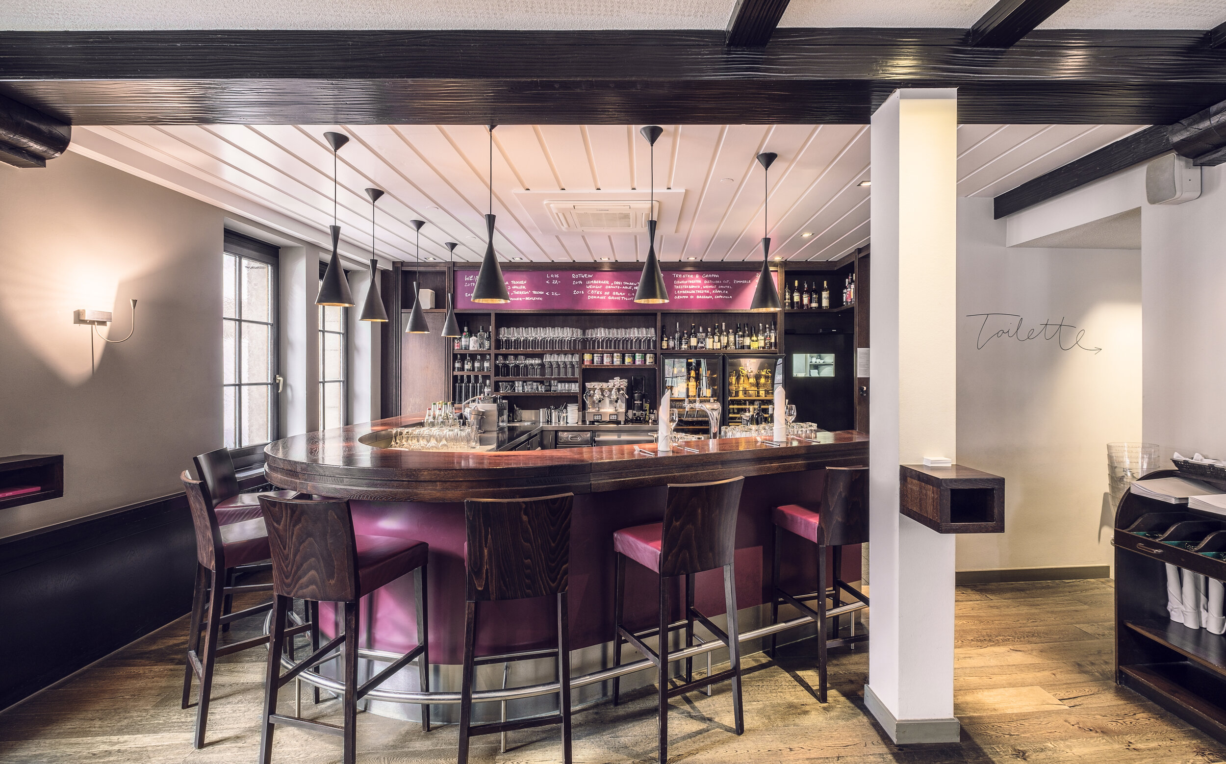
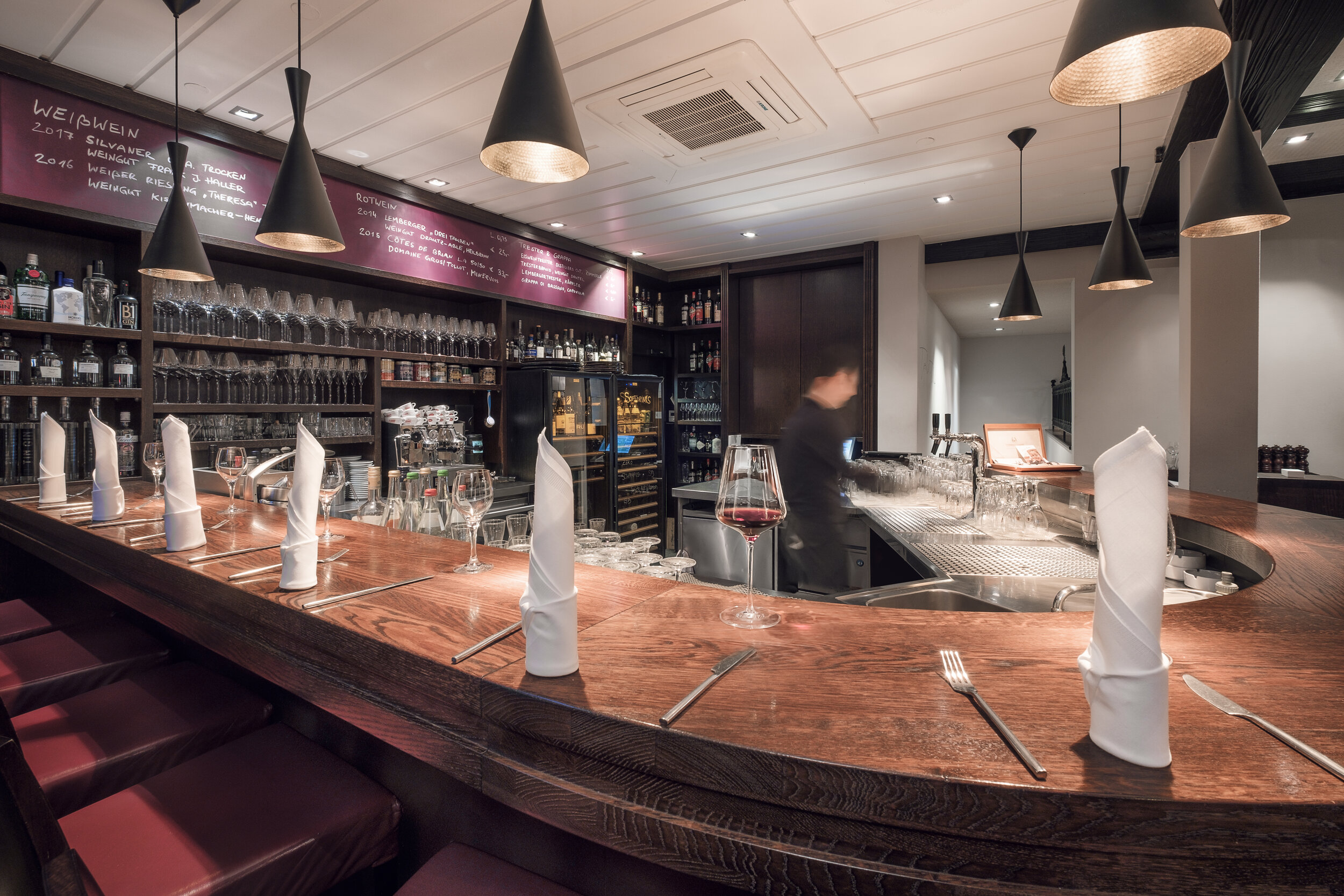
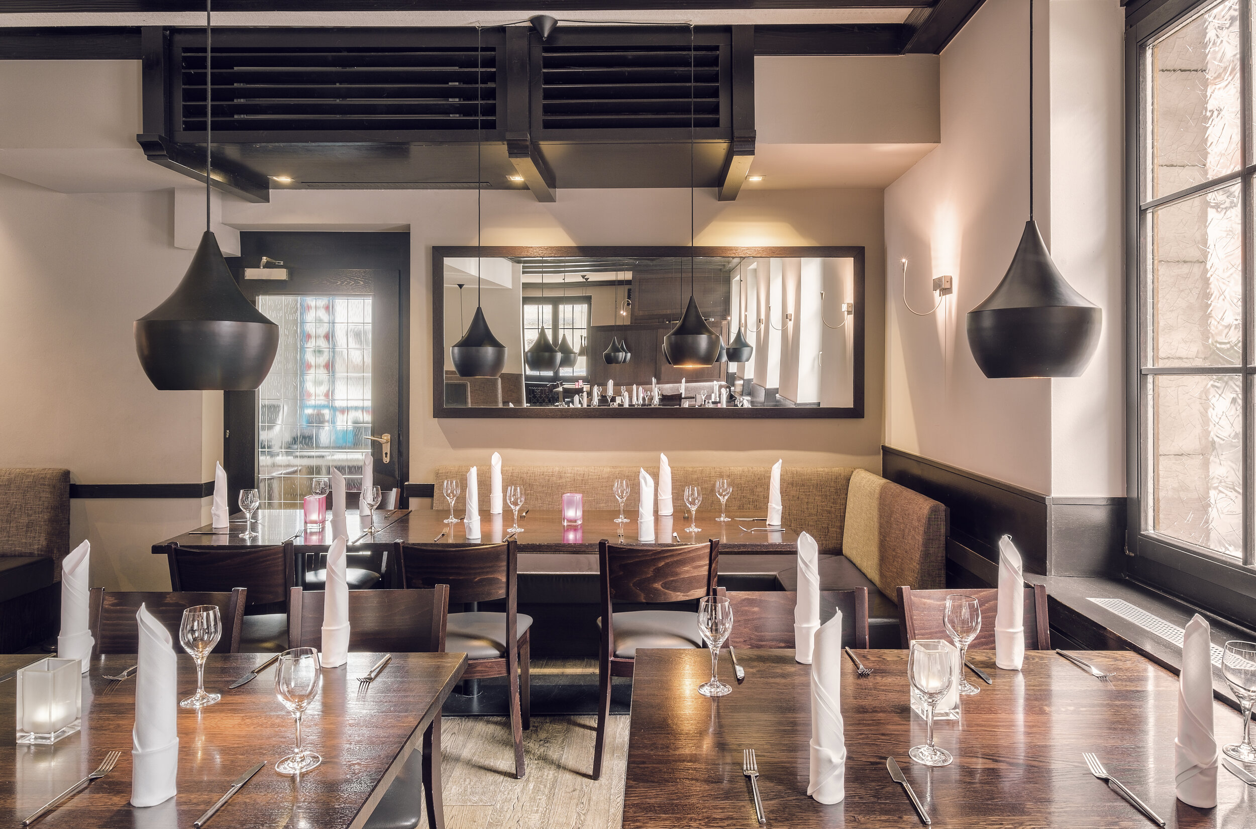
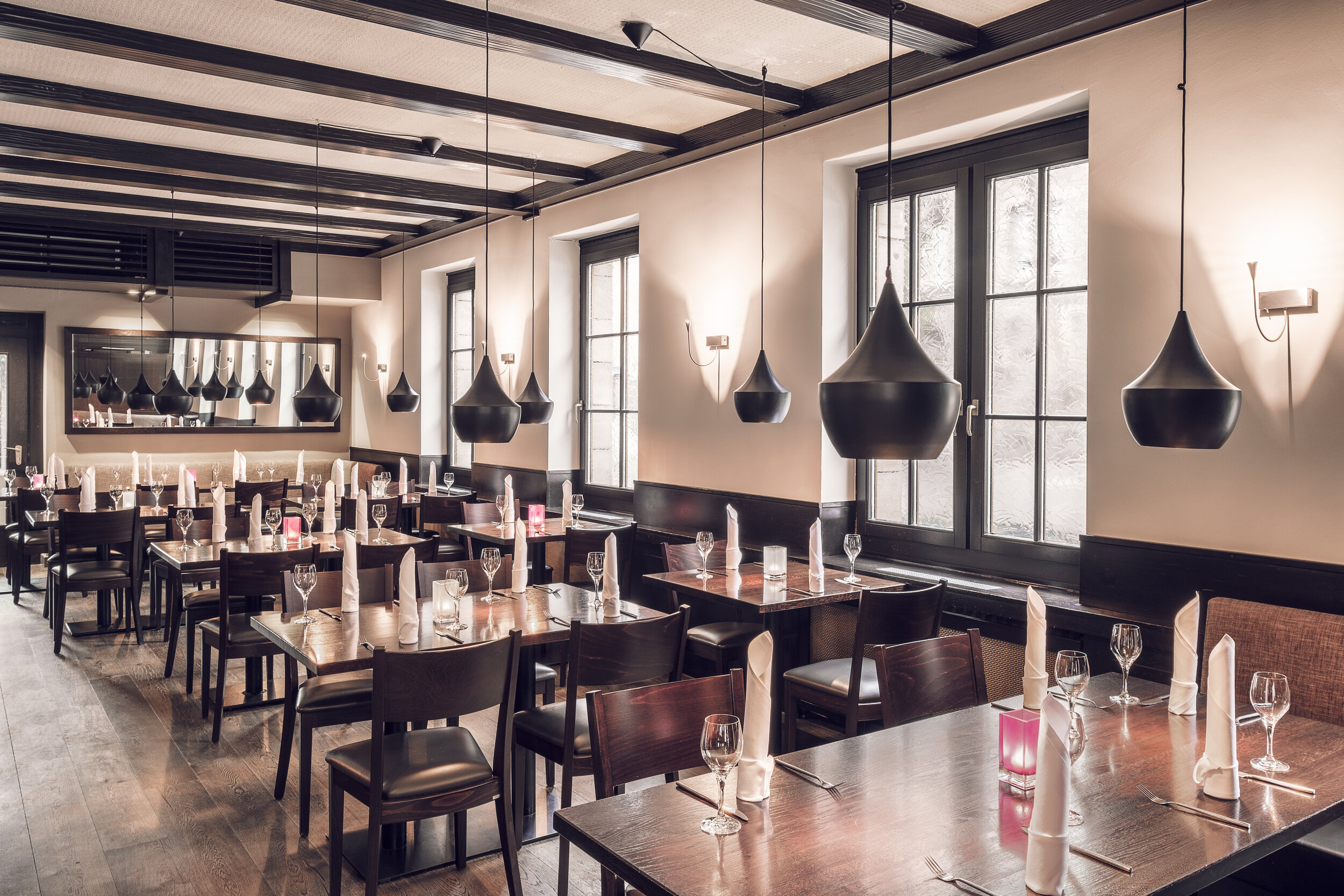
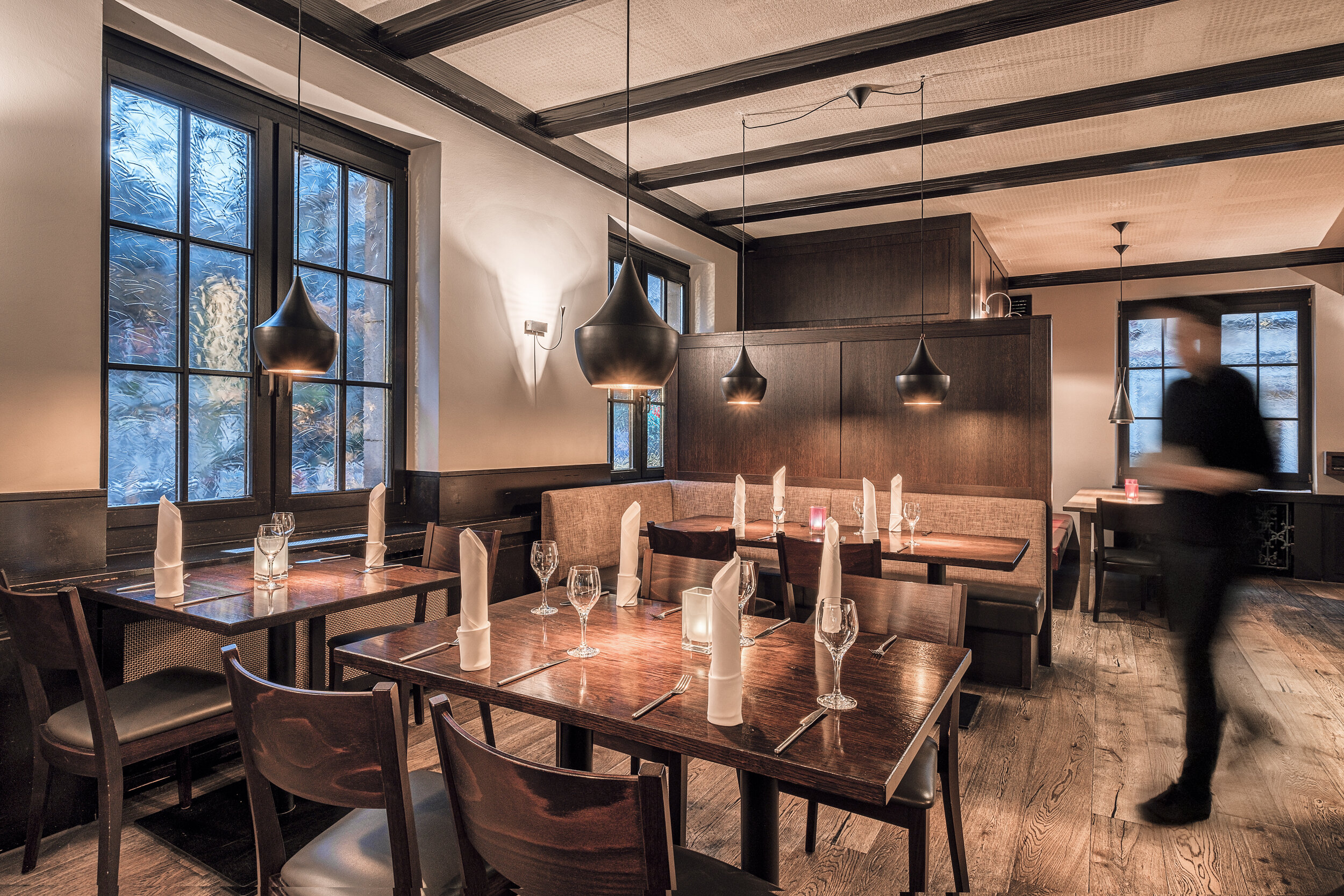
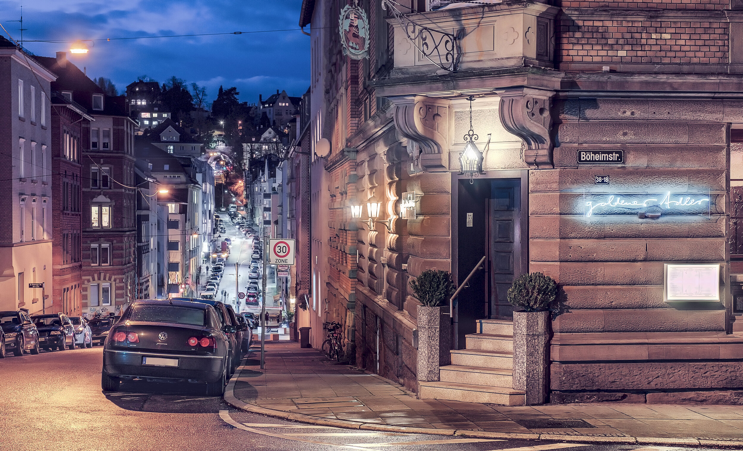
Restaurant Goldener Adler Stuttgart - Germany

I've heard some agencies saying: "Well, you take cool pictures of very nice places, but it's not that hard to make perfectly designed resorts or beautiful places look pretty. Can you also make ordinary things look good?"

- YOU are the judge to answer that! Can I?

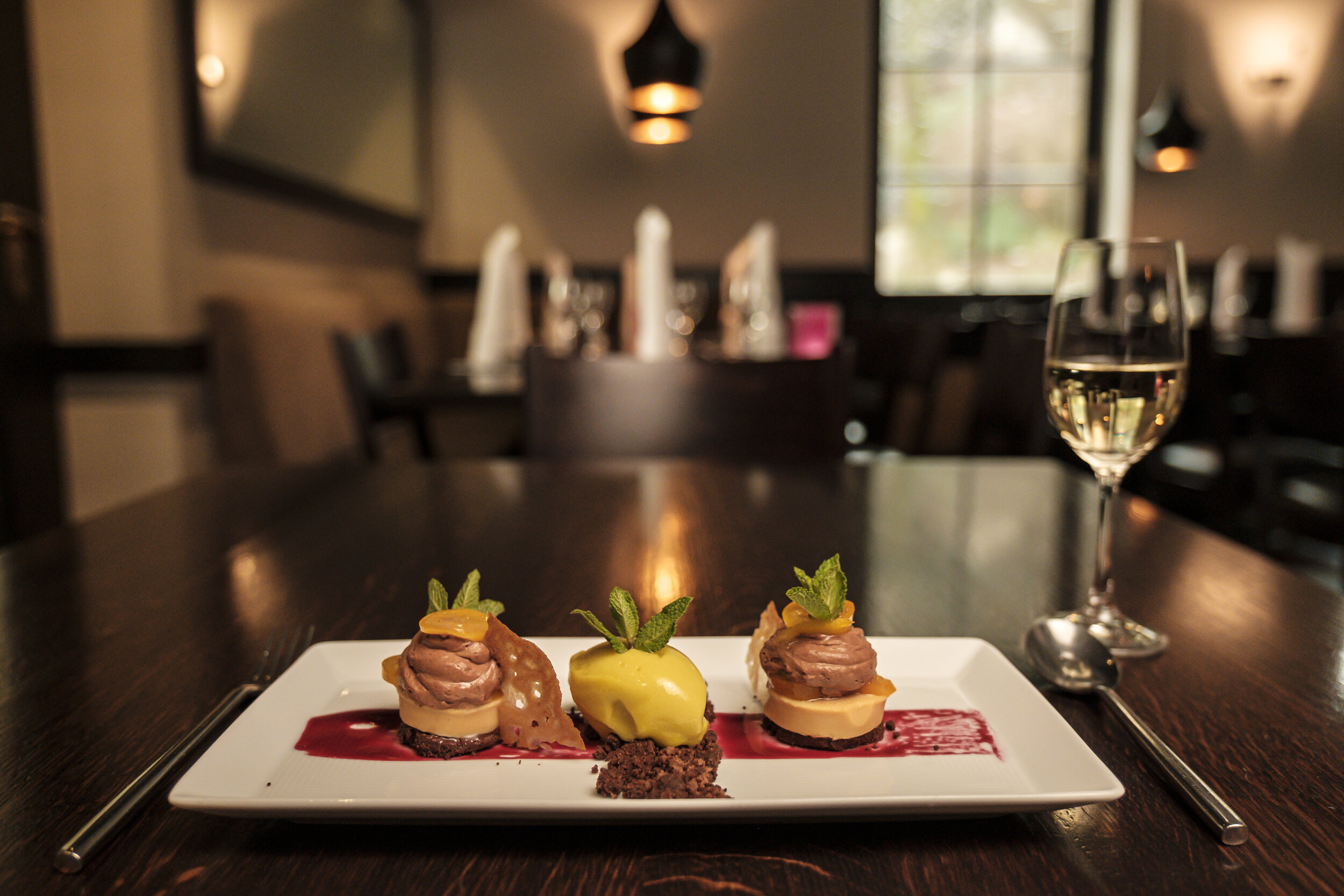
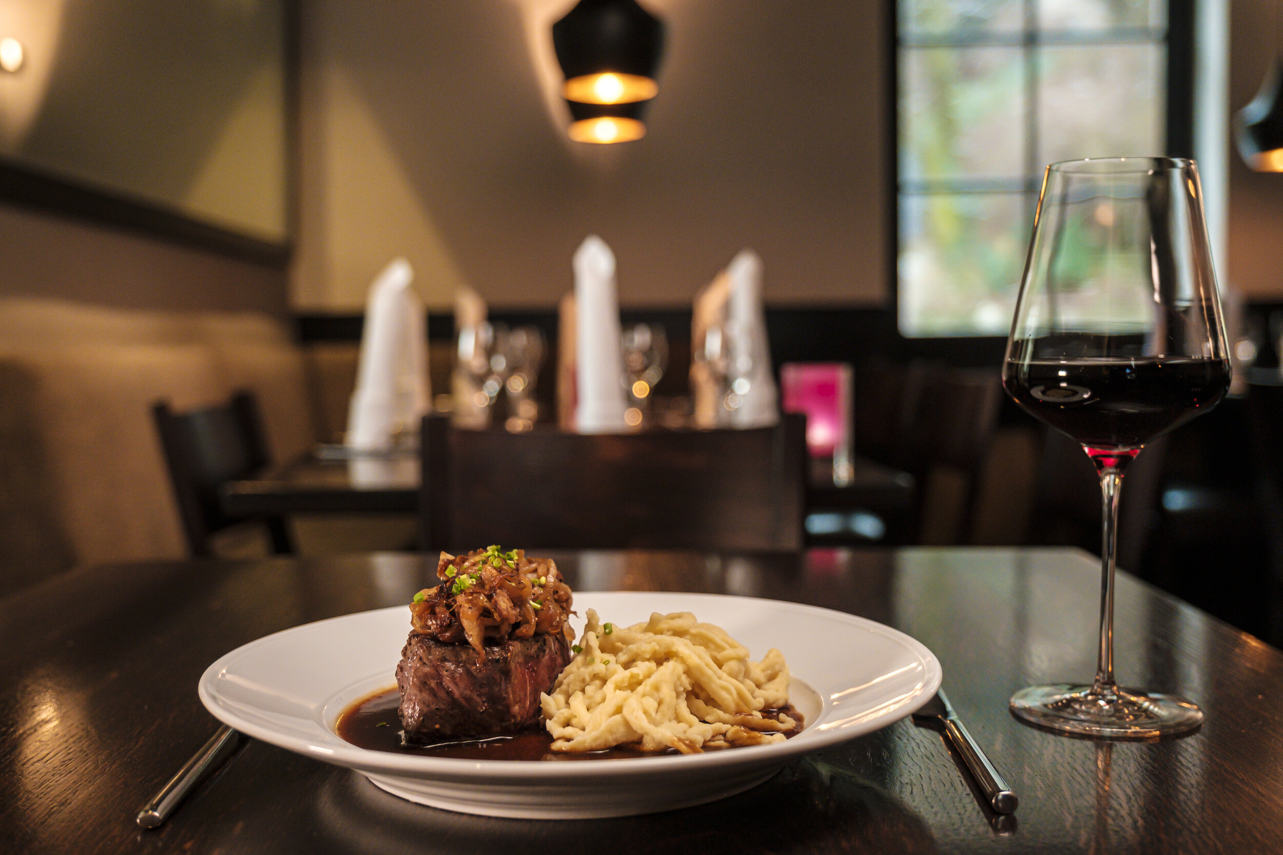
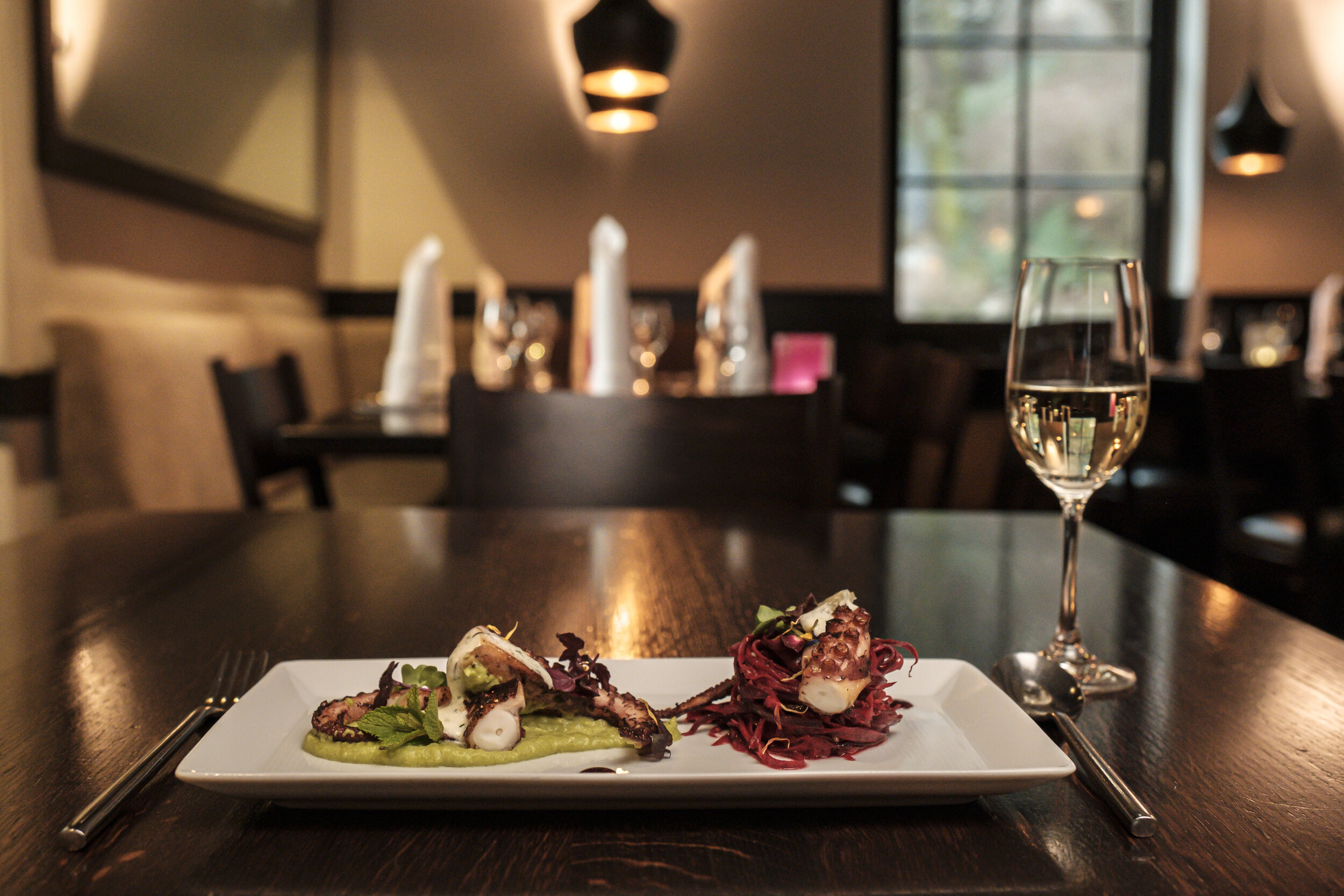
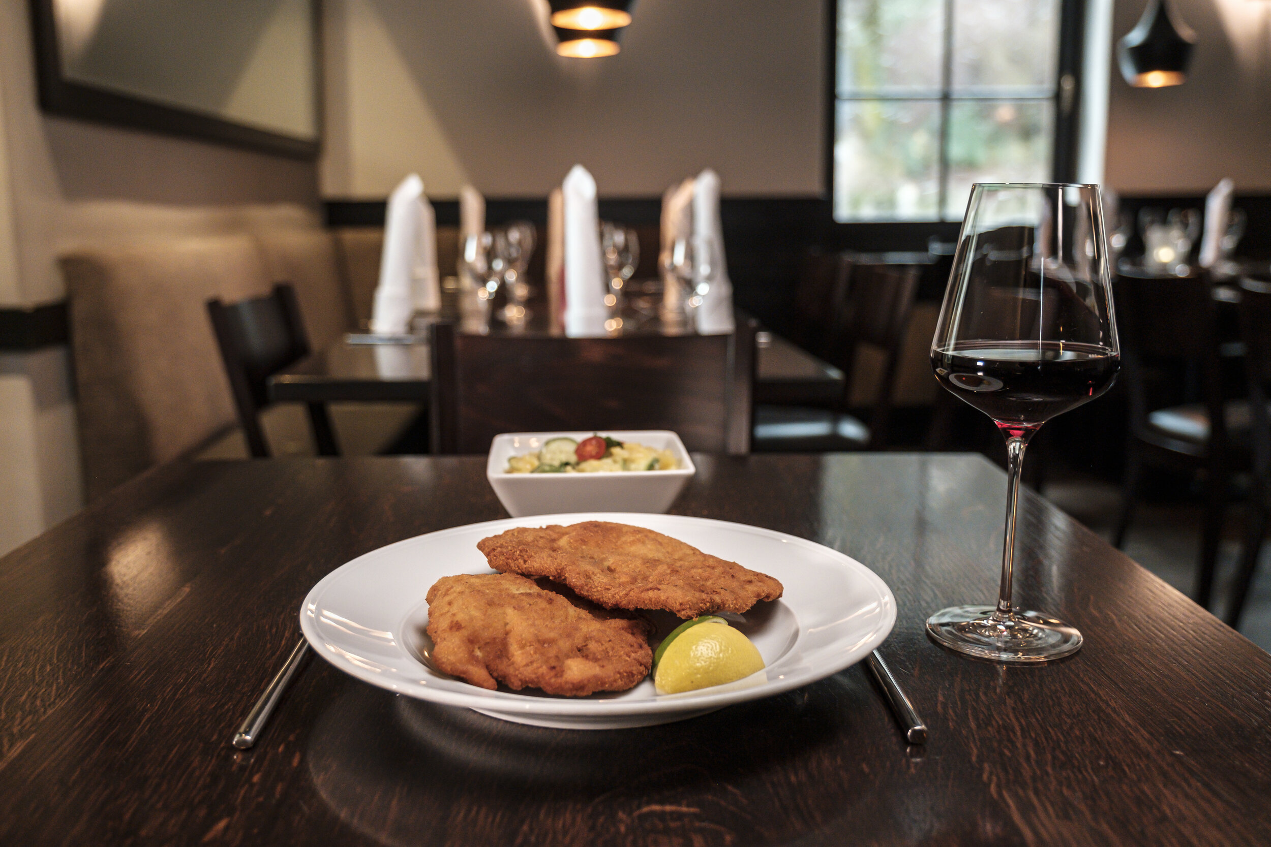
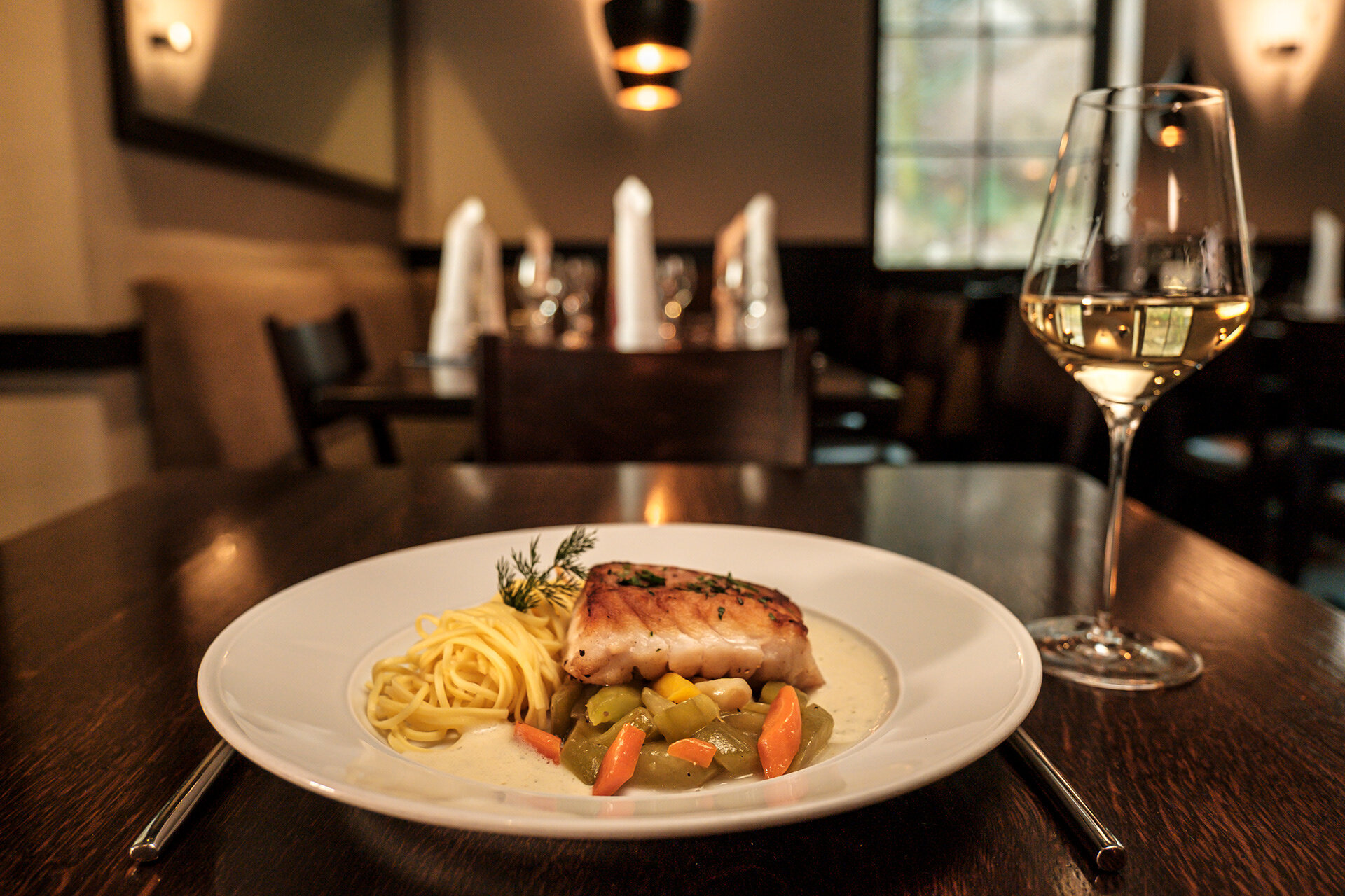
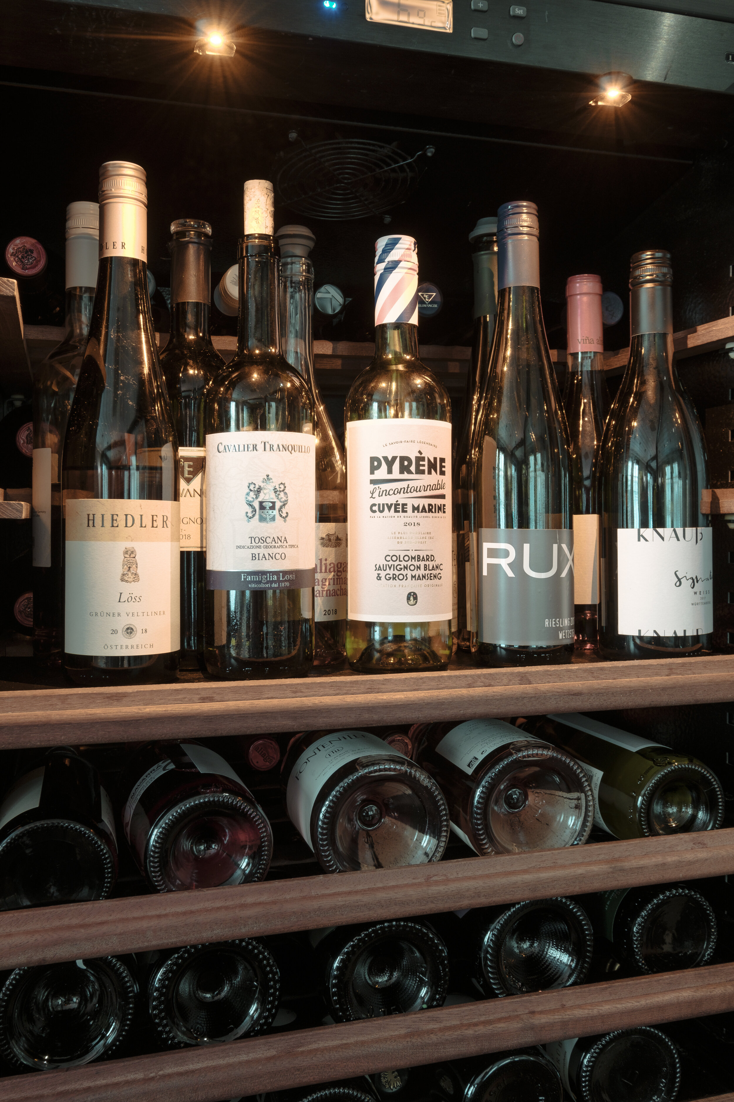
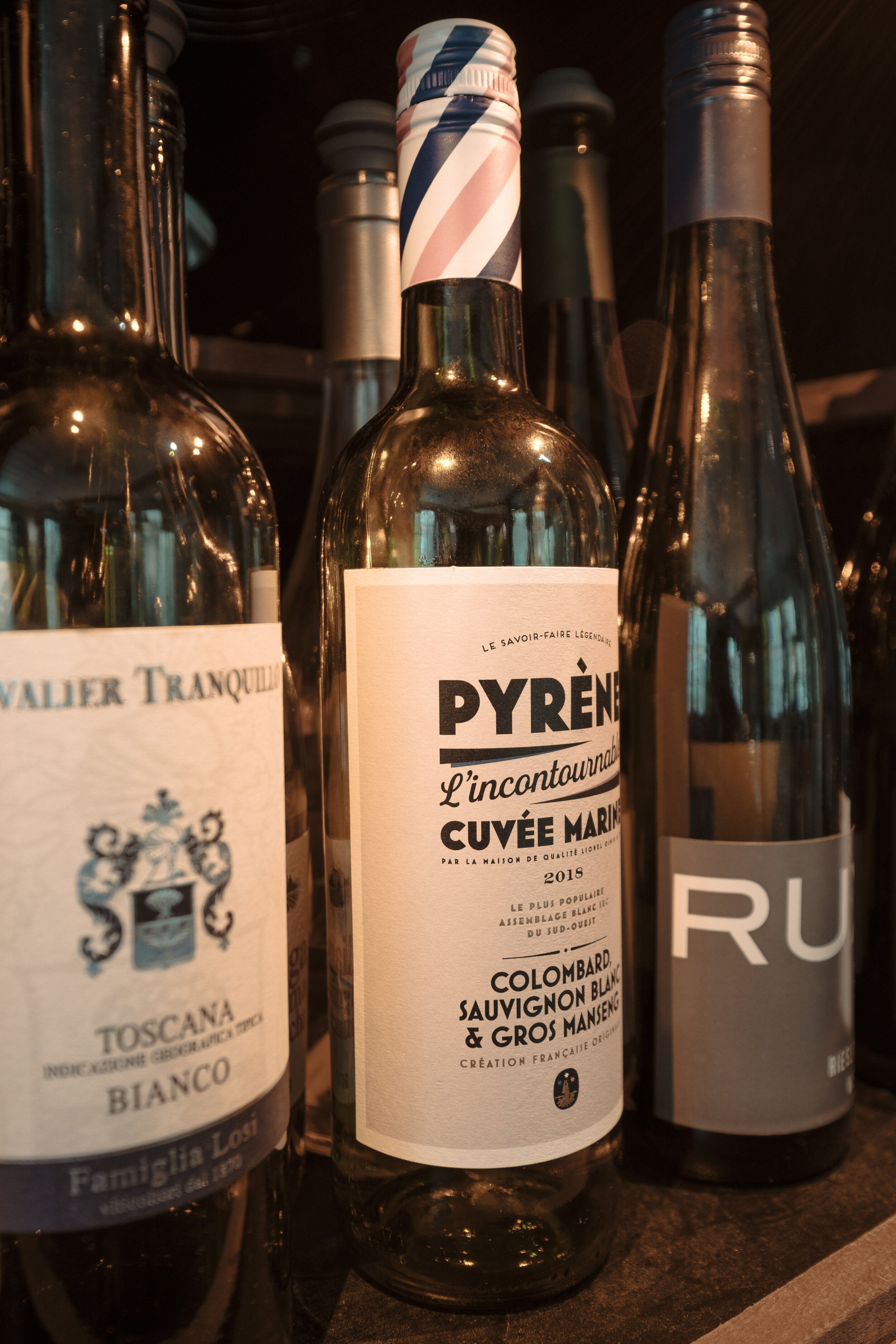
Just 2 days ago, I was hired to shoot an entire for the website of a local restaurant, here in Stuttgart, Germany. The restaurant itself, is not designed in a fancy way. Nonetheless, they are known as one of the best restaurants in the city, due to its amazing food! They annually receive the Bib Gourmand. After many years, they wanted to create a new website. So they hired me as one of the many photographers and agencies they've interviewed. The goal was, to make it look nice, but not over-realistically fancy. Just high-quality casual in a tuned-down manner. For the first time, I also photographed food. I'm not a professional food photographer but for this purpose, I think I can be very happy about the overall results.
--
More on snapshopped.com and instagram.com/snapshopped
Herzogenaurach | Architecture series | Adidas & Puma headquarters

As I recently started exploring my surroundings by bike to get my head free and allow myself a break from all e-mail and agency marketing, as well as from educating myself on the business of photography, building a brand, taking and editing photos, I undertook a one-day excursion to Herzogenaurach, a city 25 km away from Nuremberg. It was my destination, since I’ve learned that two of the biggest sports brands’ headquarters are located there: Adidas and Puma. Obviously, the chances were high to find extraordinary architecture there.
During this public holiday, it was a peaceful and speedy ride through the hinterland of Nuremberg, through forest, fields and rivers. Arriving at my destination, I scouted everything: The adidas store, the headquarters, the parking lot, Puma’s store and headquarters. As it was for leisure purposes, I just took some casual pictures.

Of course, I could not leave it like that, so I had to come back and photograph it properly to add some of those pictures to my portfolio. At first, I purchased waterproof bike bags, to safely transport my gear. They came in very handy, as I encountered a strong rain shower on the way there. Luckily, the evening turned out as the forecast predicted: A mix of sun and clouds - perfect conditions for architectural pictures.

Adidas headquarters

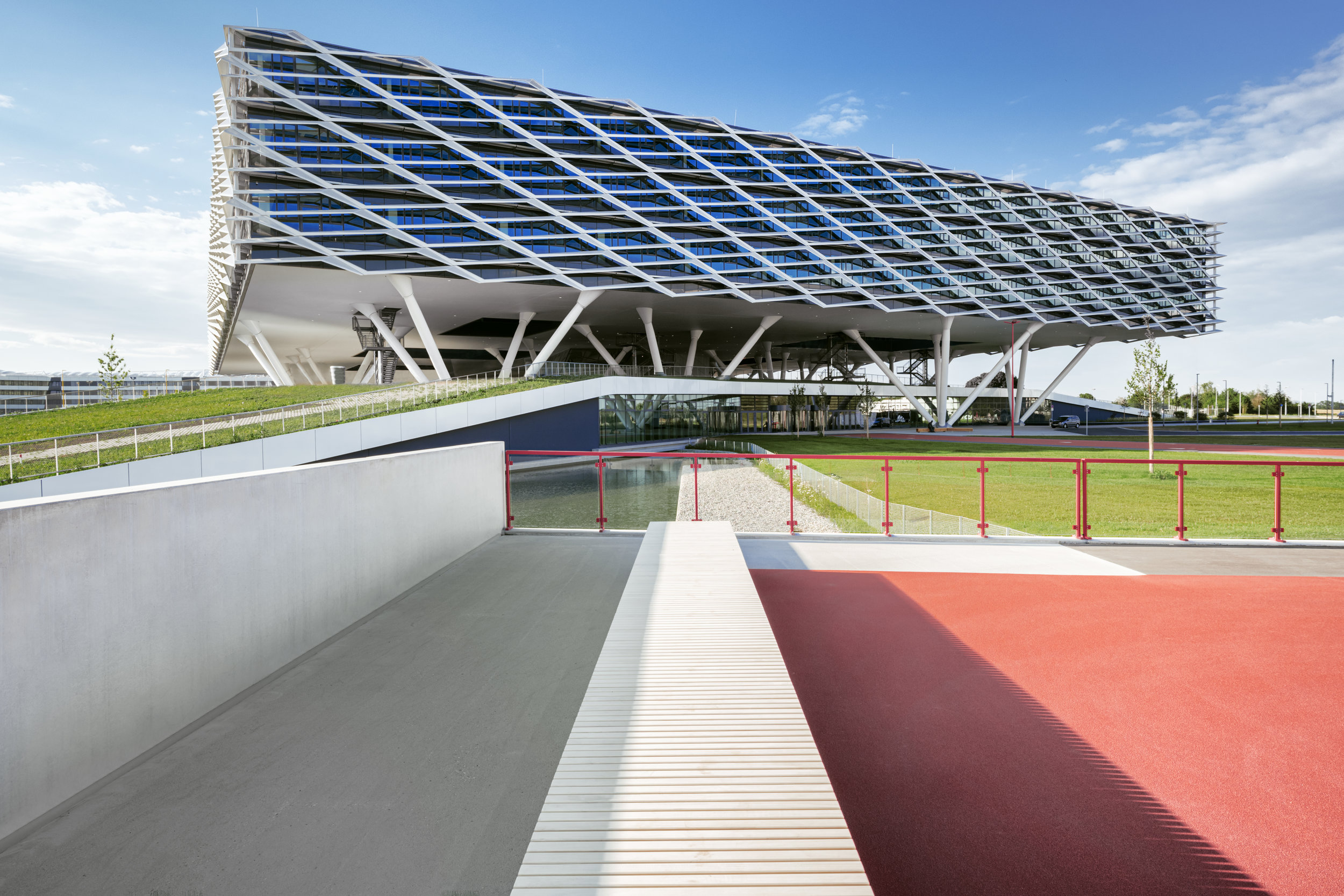
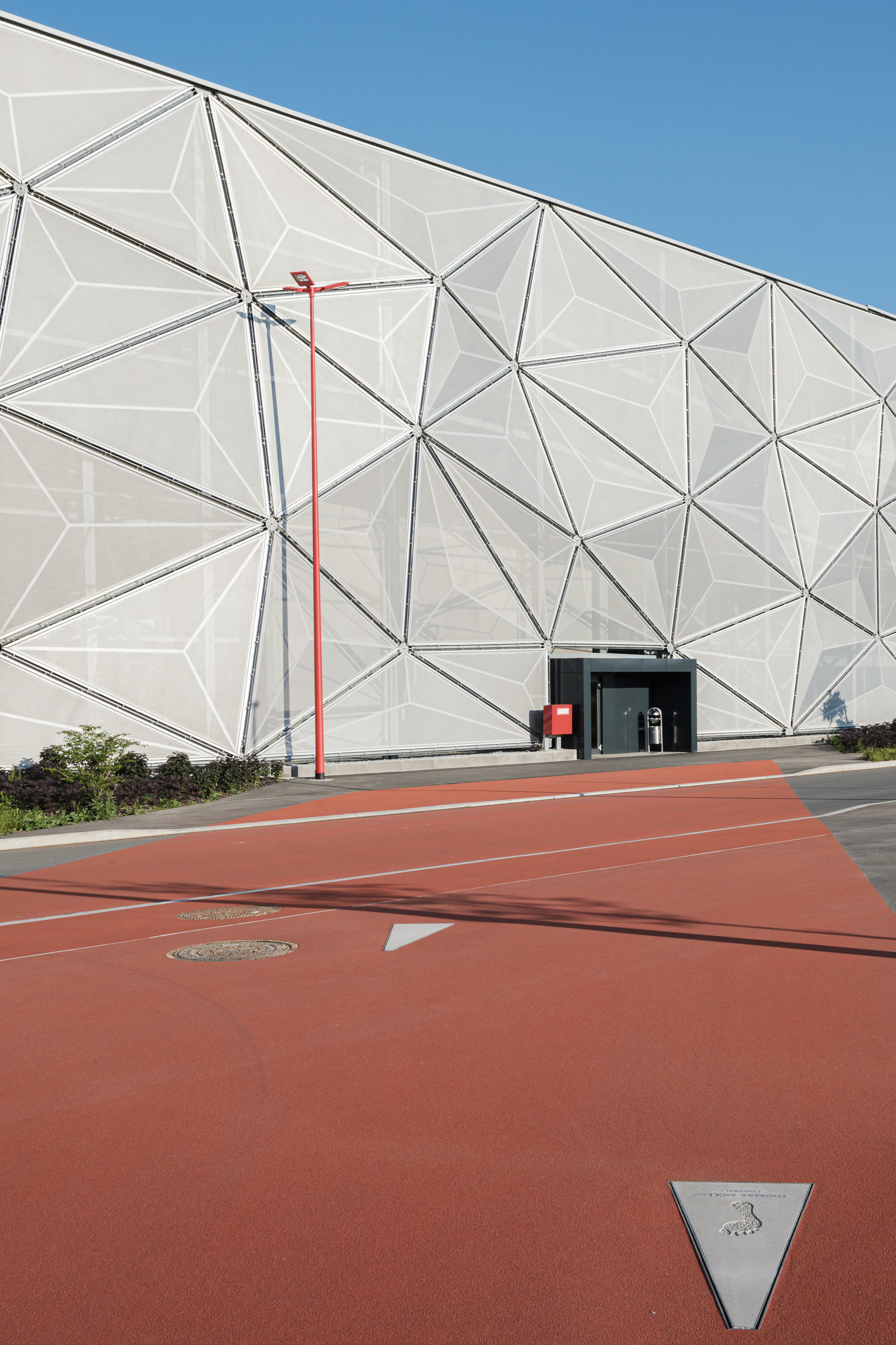
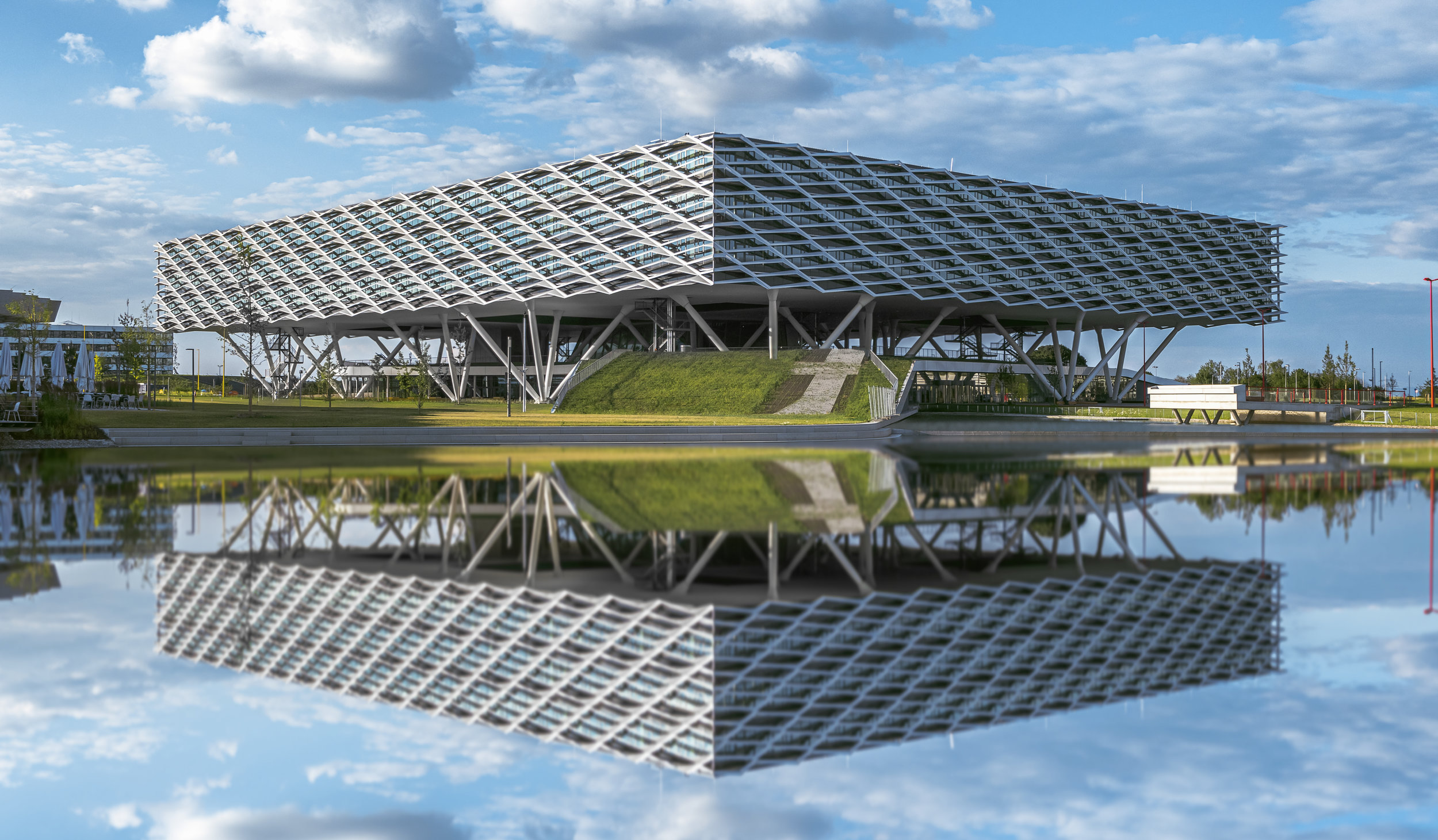
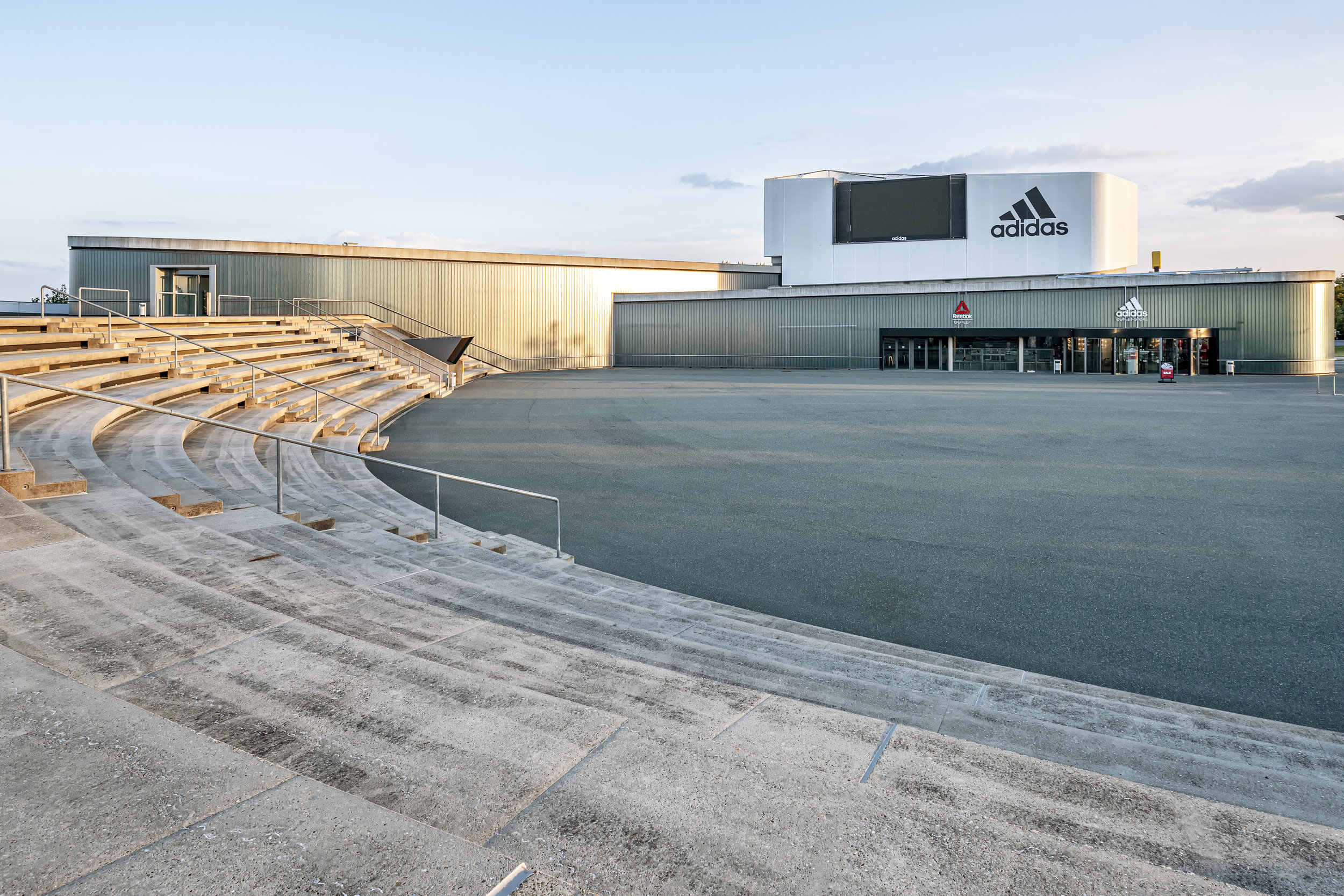
Photographically, I started off with the main building of the Adidas headquarters, the most impressive architectural achievement of this district. I really loved how they recreated the entire area in the style of a sports stadium, including a tartan track with embedded footmarks of well-known sportsmen (e.g. Thomas Müller - football player), inspired by the Broadway’s Walk of Fame. The strong colour contrasts between the tartan track, grey streets, green grass and the blue sky was just amazing! Even their parking garage (picture 2) looks like a football stadium - at least to me - as it reminded of Munich’s Olympic Stadium. All buildings were connected to each other following the tartan tracks, creating very strong compositional leading lines for photography. They posed one challenge though: Almost all lines were adjacent to each other, making it very difficult to settle on my typical one-point composition, in which all lines converge into the center of the frame. After a while of scouting, I finally found the one-point perspective created by a wall, a bench and the shadows they casted on the ground, opening the frame and leading your eye all the way from the front to the back of the image, while other lines intersect each other. That’s why I really loved this shot! Clean leading lines and precision are important key elements for compelling architectural photography. In the end of the day, I captured a clean reflection of the building in its surrounding artificial pond.

Puma headquarters

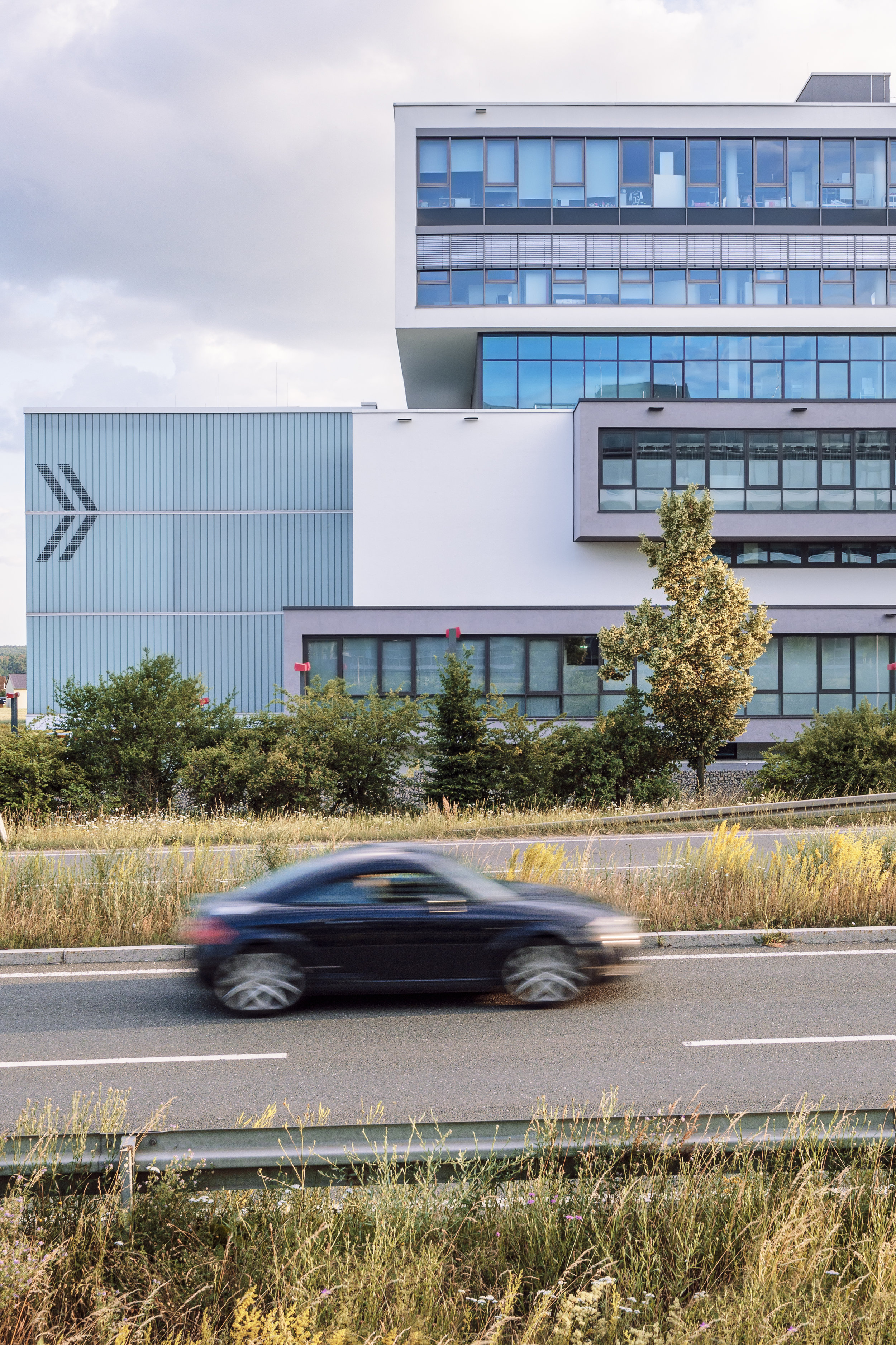
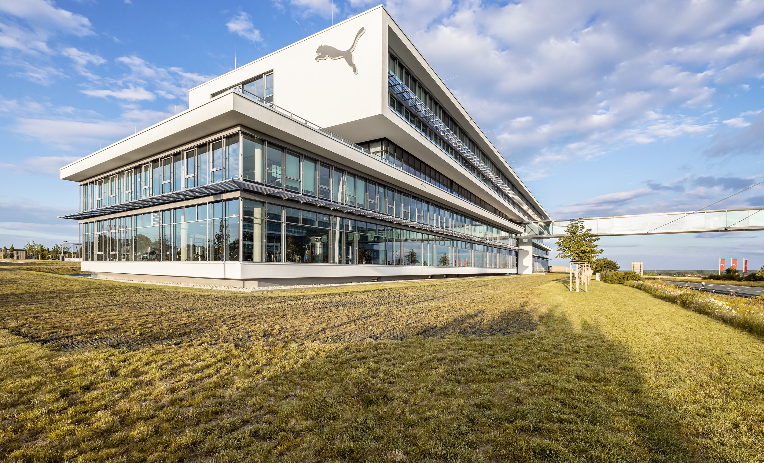
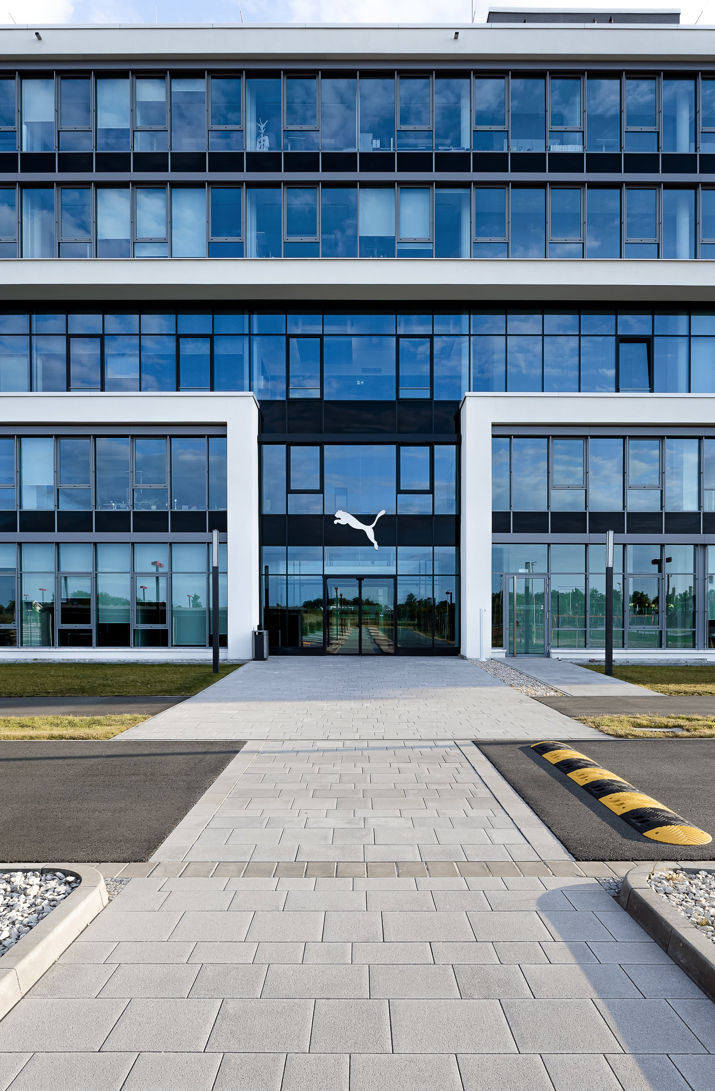
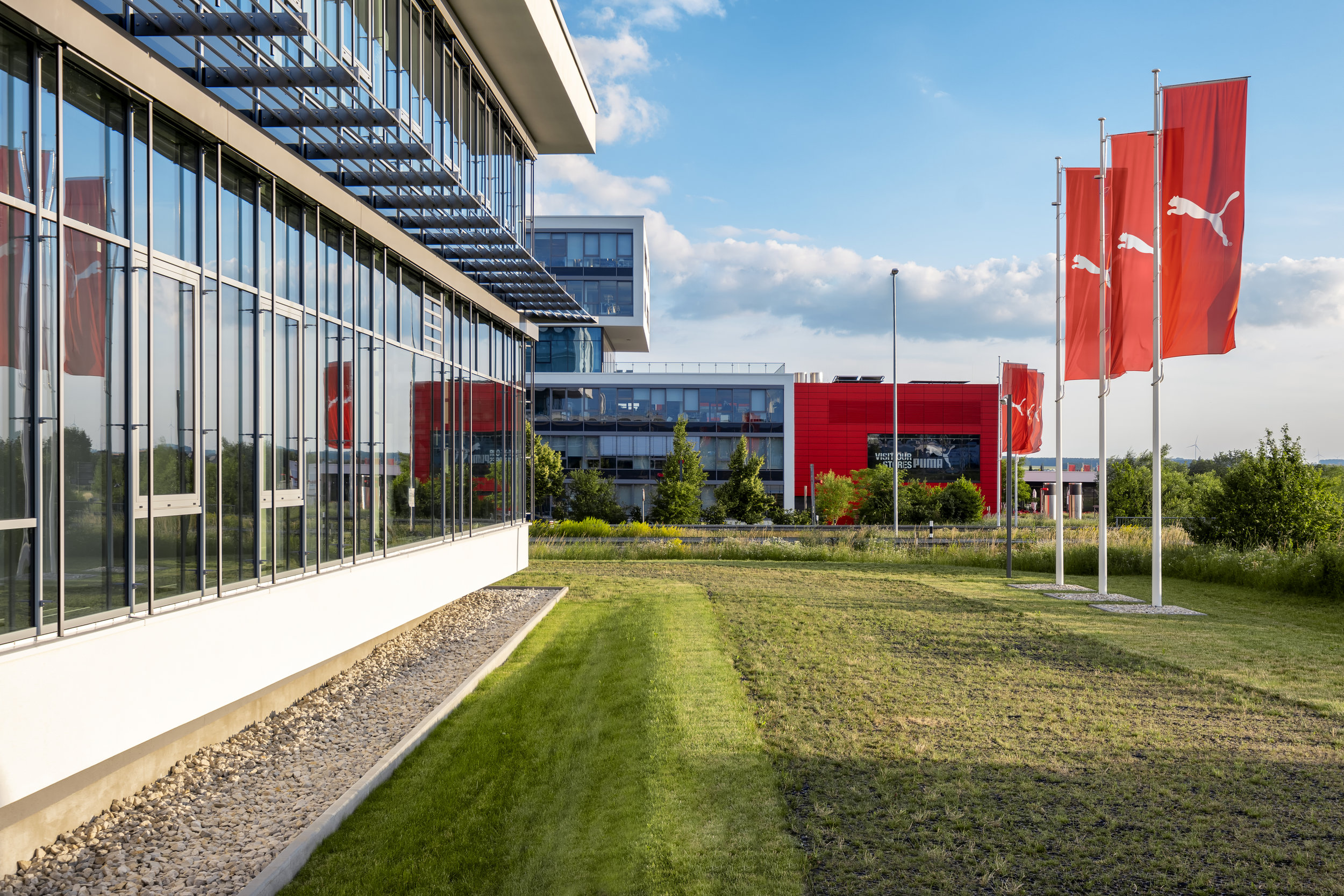
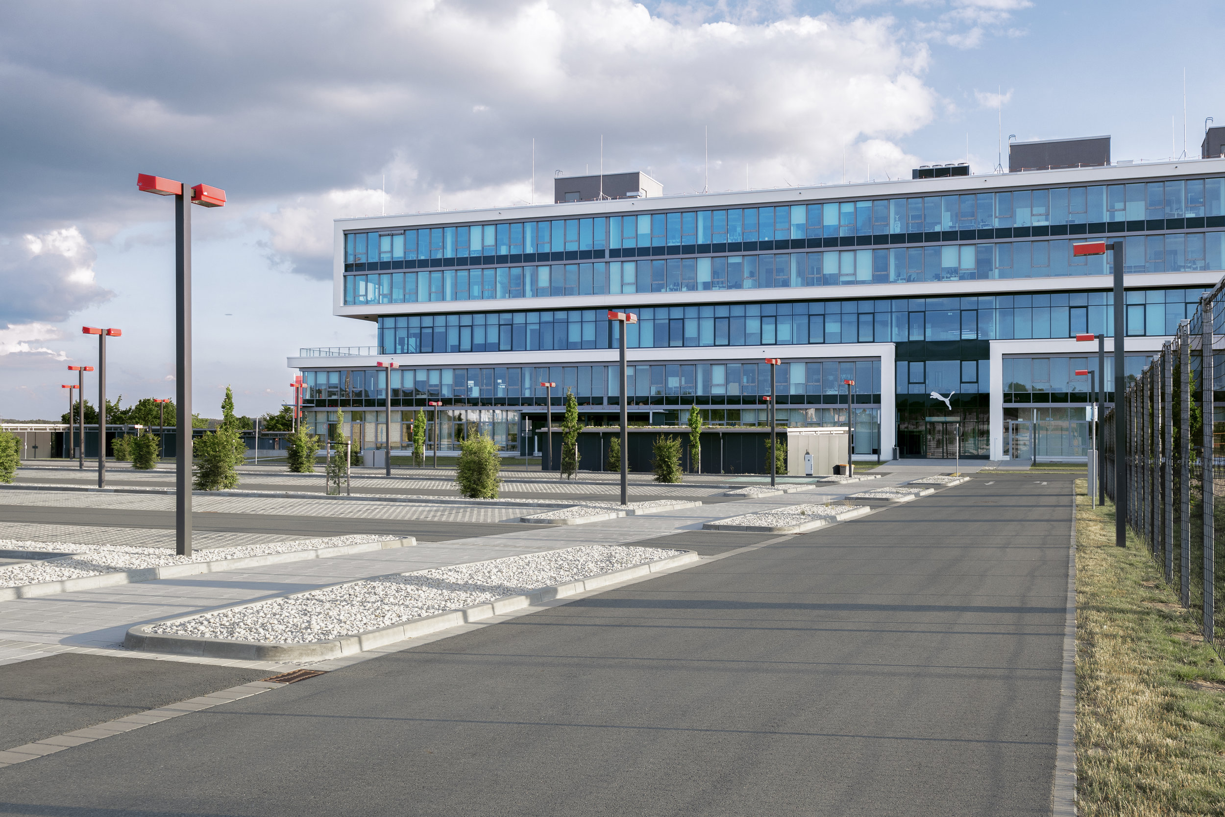
Having finished my job at Adidas, I headed over to the next building, 2 km away: The Puma headquarters. Main features there were clean cubistic elements in different tones in the palette of white over grey to black, in contrast to shiny windows reflecting the blue sky. Obvious to the eye was the red branding, e.g. red lanterns, red flags; those red colours accents which we already saw at Adidas that interestingly connects both subdivisions of one company. Really smart! This corporate design of red can be found on their shoeboxes and almost all labels. That is successful and very well-thought-through corporate branding and design.

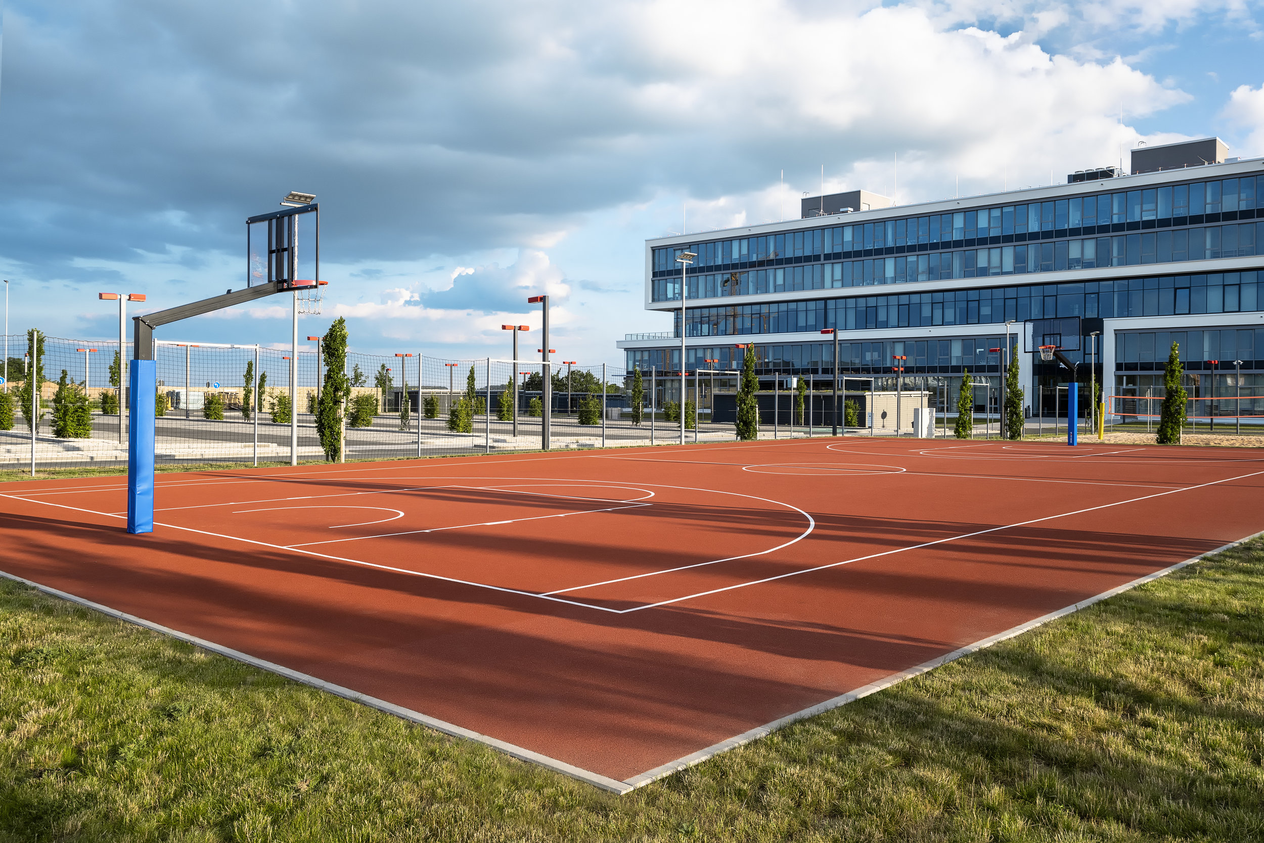
Other architectural features are the sports facilities in front of the building, such as a football, beach volleyball and basketball court, which can only be used by adidas staff. If I’d have to spend my day at an office, I’d love to use them and have a workout with my co-workers. A fantastic idea again!

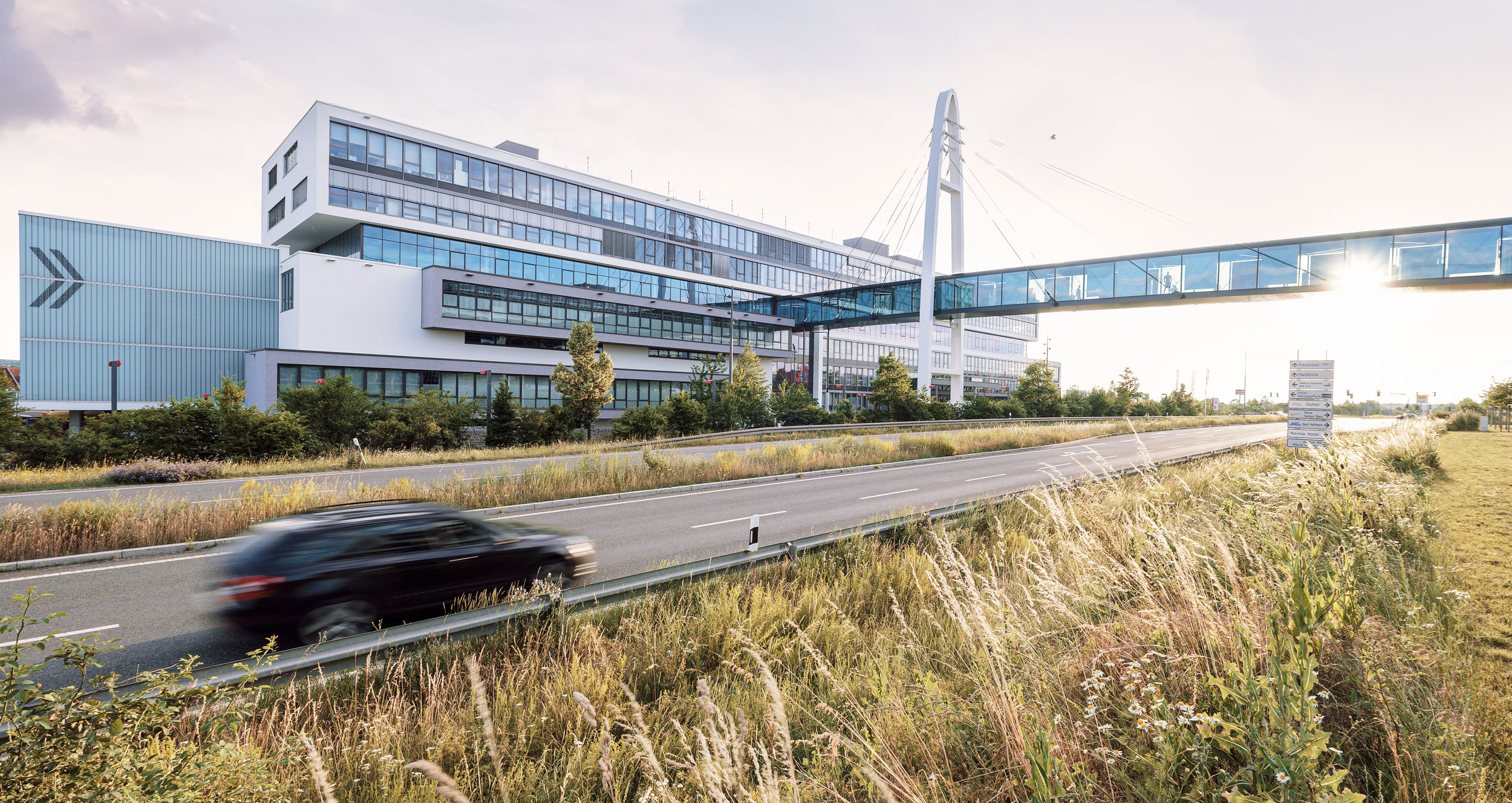
The most appealing to me as an architectural photographer was it though, that the Puma headquarters strech from one side to the other side of a highway, being connected by a hanging vitreous suspension bridge across the highway. I just had to wait, using the app Photo Pills, until the sun was shining through the glass of the bridge, while a car passed by creating dynamic car trails. it was all captured handheld in one shot; no compositing in Photoshop! Hence, you can easily imagine, which is my favourite picture of this series.

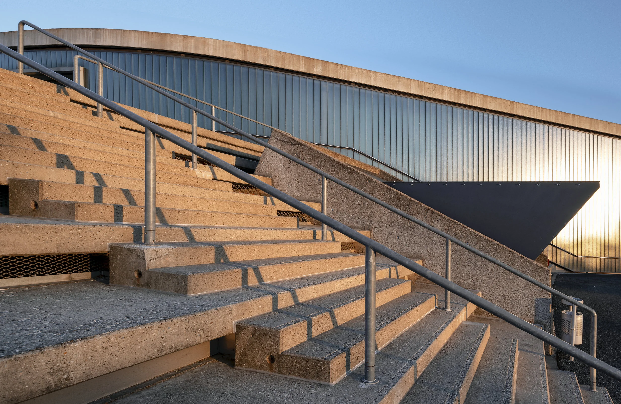
On my way home to Nürnberg, I captured some casual bonus shots of the Adidas outlet store, which really looks like a sports stadium. The golden sunlight gave the rather grey concrete a beautiful and magically glowing light.

Photos by #matthiasdengler #matthias #dengler #snapshopped #fotograf #nürnberg #architektur in '#herzogenaurach #adidas #puma #headquarters
LUX - Junge Kirche Nürnberg | Young Church Nuremberg | Germany - The architecture of Nuremberg - Part 4

Good news, it finally has become summer! :)
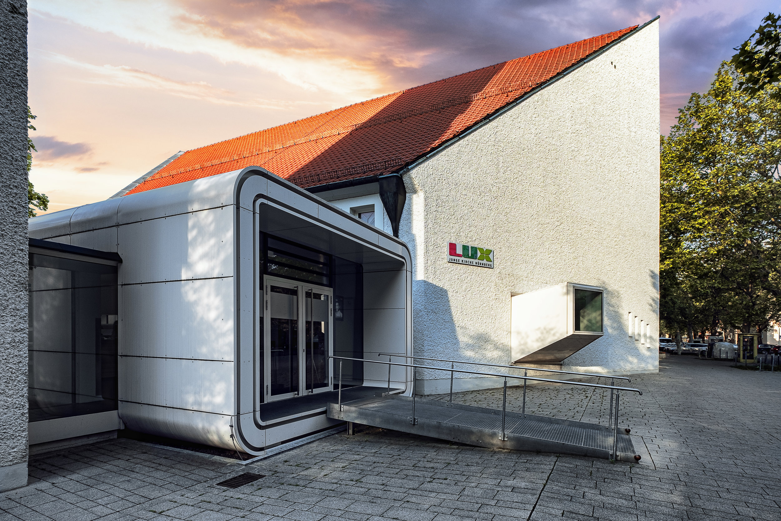
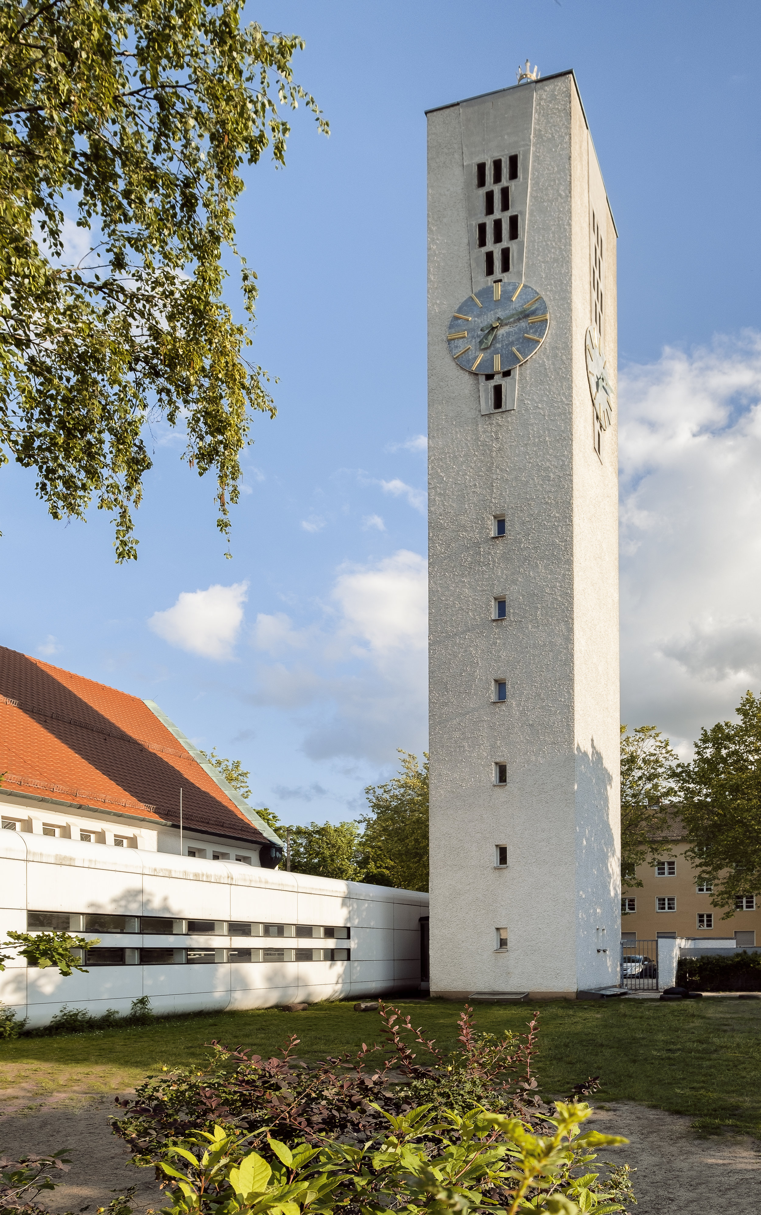
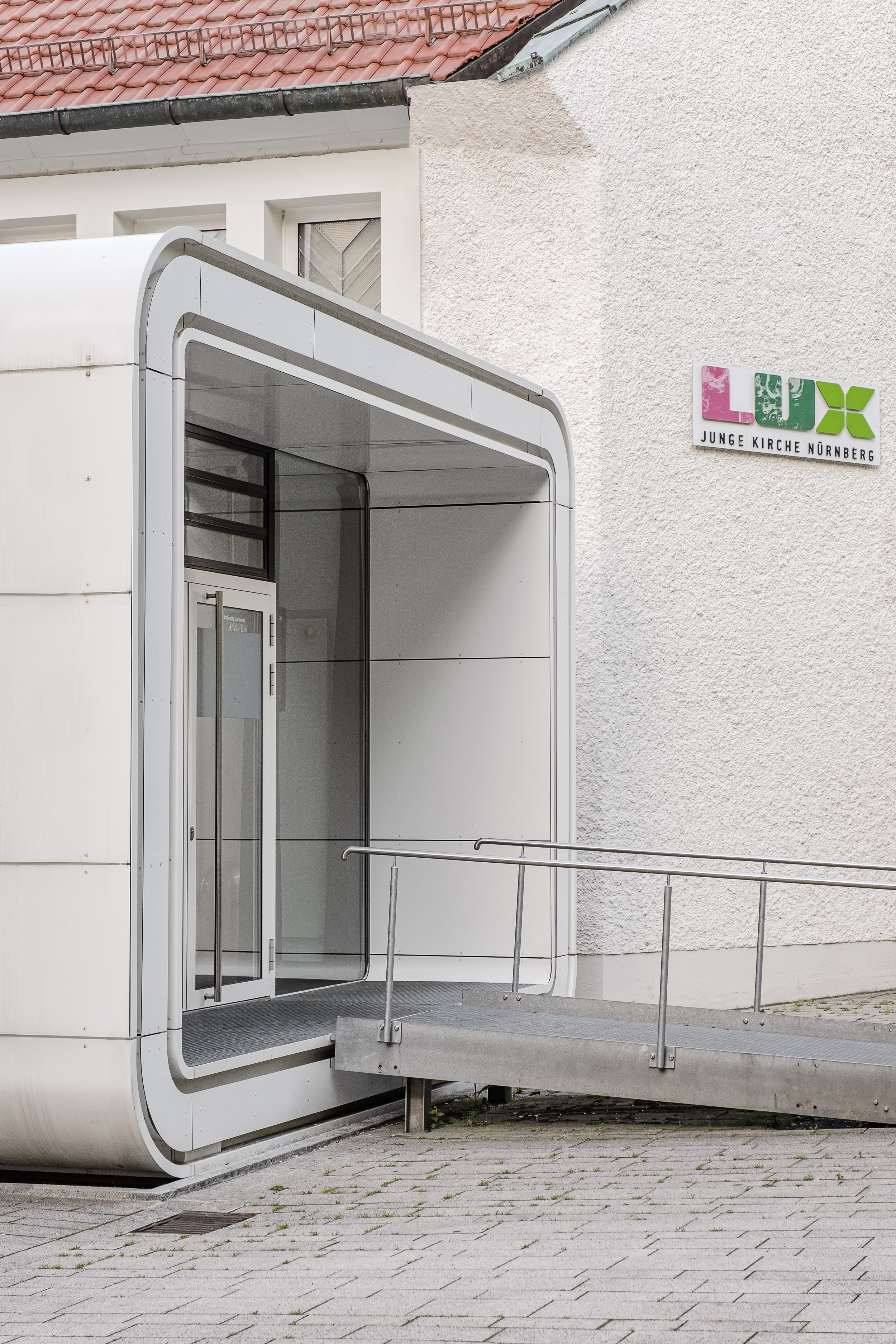
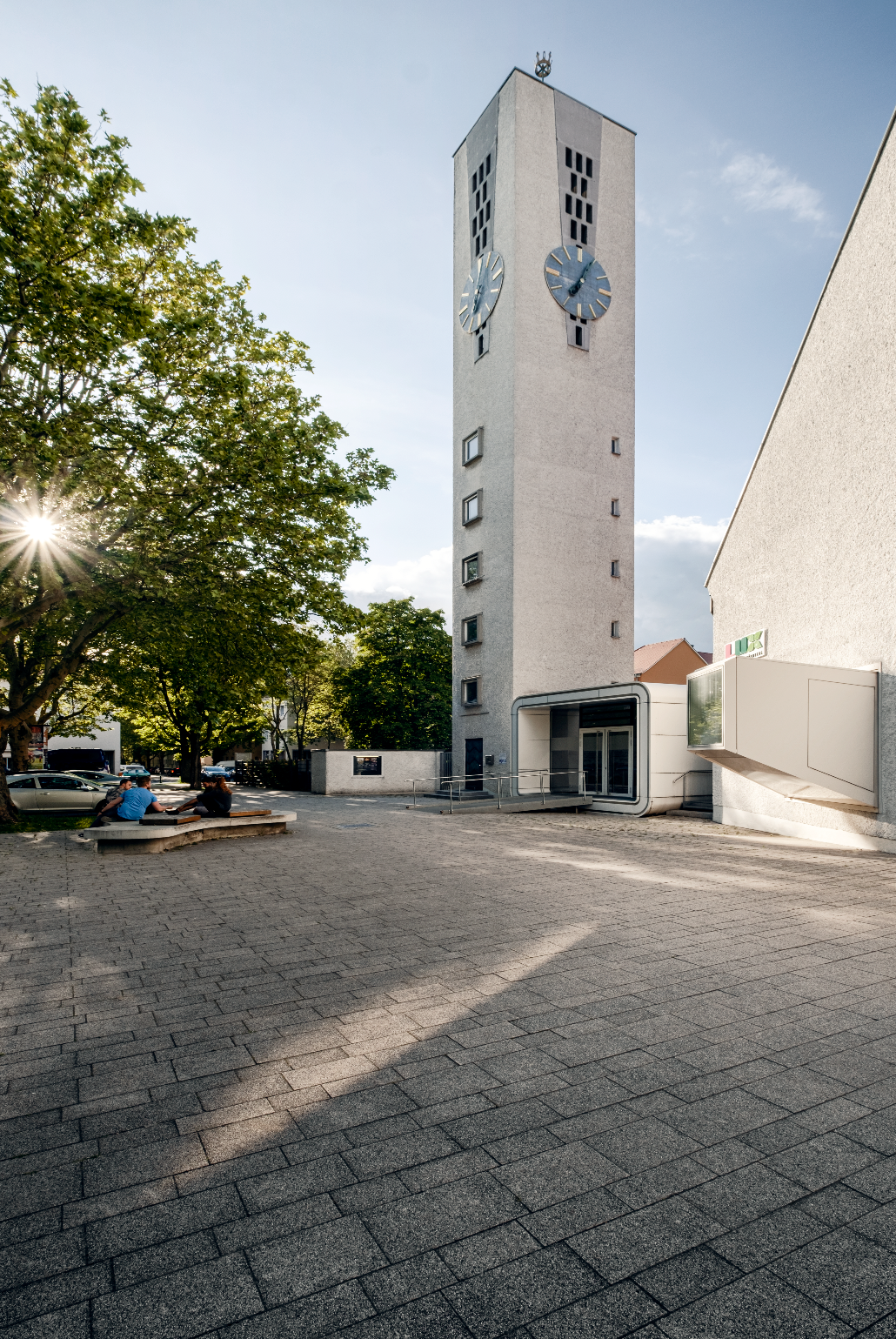
So now, I can go out in shorts, not shielding myself from wind and rain; instead, just relaxing, enjoying the moment and waiting for majestic sunsets, as presented in the first shot of this series. Due to the good weather, I could continue my project of photographing the Lux - Junge Kirche Nürnberg. The previous interior shots focussed exclusively on the cubic modernist element which has been added as an annex to the main church. The main church will be photographed as soon as I get technical assistance to manage all the lights inside - yes, it’s complicated, not just turning on a light switch. ;) Anyhow, as you can see below, this church really expresses modernism at its finest: a round cubistic metal box right next to a spiky shaped church building. And all of that is also still connected to a very classic and simplistic rectangular shaped church tower. And as a little detail, there’s another cubistic element attached to the main wall. The funny thing is, from the inside it is so steep that it can’t be used for anything useful actually. It does flood the room with light though (a normal window could so, too), but still it opens the office of the employees and gives it a more airy feel to the otherwise dark office. I glad I found this church and could add the first sunset picture to my portfolio. Last but not least, I want to mention how laid-back and casual all employees and church visitors are. It is a fantastic atmosphere and such a place could even make me consider to go to church from time to time.

Photos of LUX - Junge Kirche Nürnberg by Matthias Dengler #matthiasdengler #snapshopped - Architektur Fotograf in Nürnberg

Follow me behind the scenes and for more imagery on :
Flickr Instagram (Architecture & Travel) | Instagram (Portrait & Fashion)

Top